We get a lot of interesting projects in, here’s a cool one- Jim Heck, of Classic Playfield Reproductions brings in a vintage pinball table for us to scan!
July 15, 2010
July 14, 2010
June 24, 2010
Welcome to ParrotTalk!
Welcome to the Parrot Digigraphic blog, ParrotTalk!
Here we have a good array of tech support tips, such as how to install your custom Parrot or Angelica paper profiles, how to make sure your color settings are in good order in Photoshop, some ramblings about photography, art and printing, and even some of our little secrets- (yes, even the Printer Repair Cat!)
You can use the Search feature to find what you need, or simply scroll through the listings on the right. Never hesitate to contact us if you don’t find what you’re looking for…
Thanks for stopping by, we welcome your comments!
- The team at Parrot Digigraphic
June 23, 2010
The Paradox of Palette: Black-and-White Digital Photography

Art, for all arguments and discussions, is about expression. Artistic expression throughout history is as linked to the medium as it is to the artist. Even if we look back to prehistoric artists, making images of animals on caves in Lascaux, the work we see is a melding of the artist’s vision and the tools at hand. The beauty found in these primitive cave paintings is not only about the colors and forms—it is about the ability of the artist to express these forms, feelings, and sense of the subject using the simplest tools and pigments.
I have a favorite story about Pablo Picasso. The story goes that he was living in Paris, and for a while was short on money. He had developed a following, and he could sit down in a café and pay for his meal by dashing off a simple drawing with a pencil on a scrap of paper. Picasso was, among other things, a master of line. I can only imagine those sketches—I’m not sure if any survived, but I have been fortunate enough to see (and photograph for the collector) Henri Matisse’s personal collection, including some very personal drawings by Picasso, almost nothing more than doodles on the back of a finished work. They were beautiful in their innocence and simplicity, but also their expression. These works possess an undeniable mystery precisely because they are so compelling and expressive. Four simple lines on a piece of paper can elicit the beauty and mystery of the human form.
The black-and-white medium was the essence of photography for a very long time. It may be surprising to learn that the first known permanent color photograph was taken by James Clerk Maxwell as early as 1861—a mere 40 years after Joseph Niépce created the first photographs. It wasn’t until 1935—and the introduction of Kodachrome—that color became a viable, popular medium.
Black-and-white photographs as fine art are often distinguished as “expressive,” “sensitive,” and “creative.” Why is this? It is the limits of the medium and the photographer’s ability to work within those limitations to express a vision. Much of the power of a black-and-white image lies not in its representation of reality, but in its interpretation of reality at the hands of the artist.
And here is the first rub in photography: Photography, especially color photography, is commonly described as realistic. Colors are said to be “lifelike,” “true,” and “real.” An image is often trusted—and, I would argue, mistrusted—to be a representation of reality. Right there is the issue with photography as fine art: If a medium is reality, then how can it also be an expression of the artist’s vision?
By its very nature, black-and-white photography neatly skirts this issue. The fact that a black-and-white photograph represents colors with shades of gray makes it an interpretation, rather than a mirroring, of what the artist sees. It is the simplification of the palette and the limitations of the medium that give the image its power of expression. Take this one more step, into the world of digital photography. We now have a tool—Adobe Photoshop—that has almost unlimited power in producing images and effects that mimic and recreate “reality.” We are able to create photographs with as much color depth as our eyes can perceive and print them with a larger range of colors (or gamut), more than we ever could achieve in the traditional darkroom. We can record the world with astounding fidelity.
One of the beautiful things about digital photography, and the RAW file in particular, is that our creative process has shifted more to the act of combining pieces of an image rather than capturing the image, the negative, and working with what you’ve captured. I can make a digital photograph in color and reproduce it in color, black and white, or any other interpretation of that original image by manipulating the RAW file. Throughout this discussion of the various techniques and processes of digital black-and white photography, you’re going to have to decide exactly how much you want the medium to limit you, and how you’ll use that limitation to fulfill your vision. Whether you shoot in full color and control the image throughout the RAW process and subsequent image adjustments, or you use a camera that can only shoot in black and white (a “dedicated grayscale” camera), you will learn to harness its limitations.
It’s a decision you have to be aware of, learn about, and make for yourself.
(Excerpt from Black and White Pipeline – Lark Books)
Color Settings in Photoshop
In general you want to set your color policies in Photoshop to what is becoming a Photo Industry standard- the almost universally accepted Working Color Space is Adobe RGB 1998, and the rest of the policies are detailed here, in the video below.
This will get you two very important things. First, you will be working within very common policies, and will be on the same page with almost everybody you’re working with- clients, your lab, other associates. Second, it will assure that your printer drivers are getting what they’re generally expecting to see- files generated in Adobe RGB.
Here’s how to set that up:
There are certain circumstances where a different setup is either beneficial, or required… but this is a very good place to start.
June 22, 2010
Sending the file to the printer- Color Management policies
There are two places to control the color of an image once you send it to the printer- once in Photoshop’s Print dialog, and again in the printer driver. Here’s a rundown on the process.
In most cases for color printing you want to allow Photoshop to color-manage the printer, and turn off all controls in the printer’s system drivers. One of the few exceptions is when you want to use the Advance B/W driver features of the Epson printers… in those cases you turn the color management over to Epson, and take it away from Photoshop.
Take a look at these videos- the first is showing how to print color, and the second is showing how to use the Advanced B/W driver.
I should note that the color printing process shown here works for many printers, not just Epson. The Photoshop dialog remains the same, in each driver there is some place- you may have to dig around- that you need to turn the driver controls off. It’s very common to see a “Color” tab in the driver, and a selection for “Application Color Management” and “Printer Color Management”. You need to select “Application..” if you see that- indicating the application (Photoshop in this case) will handle color.
Now for a look at Advanced B/W:
June 19, 2010
Understanding How Rendering Intents Work
Rendering Intents are, essentially, the logic used in remapping color into a smaller color space. The two basic rendering intents that we are dealing with are Perceptual and Relative Colorimetric.
Perceptual intent presumes that you want to keep the relationships between all the colors, that is, if you have colors that appear different, we want to keep that appearance when they are remapped. Converting colors with Perceptual Intent requires that we move all the colors in the space around a bit. I like to make an analogy to a sponge, or a balloon. Perceptual intent kind of squishes the sponge up, and the entire sponge changes shape a little.
Relative Colorimetric intent is more of a cookie-cutter effect. If colors are outside of the smaller space they are moved to the closest color inside the space. All the colors inside the space remain untouched. If, in the conversion, the colors being remapped lose their relationship to each other, that is, lose their “spacing”, well, so be it.
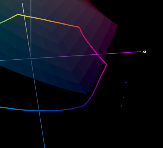
Here are some examples. I went back to our color burple, and made a couple of other colors… blue, burple and purple. Here they are, sitting well outside the Epson Premuim Luster color gamut (shown very lightly shaded).
The next illustration shows the three colors mapped into the gamut of Premium Luster using Perceptual Intent. You can see that the distances between the three are almost exactly the same, and they’ve been moved around a little. This is to maintain our perception of them, and their relationship to each other.
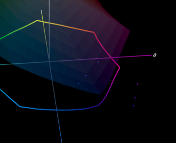
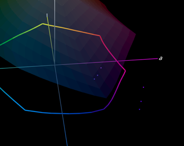
The final illustration shows the same colors mapped in using Relative Colorimetric Intent. As you can see, they are closer together, they are mapped directly into the gamut just to the nearest available color, with little concern for maintaining any relationship between them.
So when do you use which one? Keep in mind that with Perceptual Intent everything gets changed… Relative Colorimetric, only the colors that need to change get changed. There’s your answer.
You use Perceptual Intent when you need to make some big changes in your gamut, and the “look” of the colors is important. For example, if you have a full, rich blue and purple image and you are printing it to Premium Luster you may want to use Perceptual Intent so that the colors will print with the same differences and “spacing” you’re seeing in AdobeRGB, but get mapped into the colors that the printer can work with.
Relative Colorimetric Intent is really handy when, for the most part, all of your colors are inside the printer gamut, and only a few, like our burple, aren’t playing nice. We don’t need to push everything around just to get burple in there, we just need to push it in, and leave everything pretty much as it sits.
This is a great case of, if you know where your colors fall, and you know what your gamut is, you can make the best choice about how the system is going to convert the colors and keep as much of the image intact.
(Excerpt from Color Pipeline- courtesy of Ted Dillard -Lark Books)
June 10, 2010
Optimizing Performance in Adobe Photoshop CS5, CS4 and CS4 Extended: Top 10 Tips
.png)
Adobe has some great, and very detailed information on how to get the most out of your system by tuning your configuration and features settings to exactly what you need. Not only that, if you’re building a system or reconfiguring your workstation with drives, RAM or graphics, there are some good ideas about what works best, where to put your money and what is the bare minimum.
Here are my favorite tips- the top ten of optimizing Photoshop, but do yourself a favor- have a cuppa and sit down and read the links at the bottom of the page. Windows or Mac, it doesn’t matter, there’s a lot to learn, and some serious speed to be gained!
(Quotes are from the Adobe Tech site listed below.)
RAM and Processor Specs- “The performance of Adobe Photoshop CS4 is affected most by available random-access memory (RAM) and computer processor speed.”
File Size- “The maximum file size Photoshop CS4 supports is 300,000 x 300,000 pixels, except for PDF files, which are still constrained by a 30,000 x 30,000 pixel, and a 200 x 200 inch limitation.
File size capability for Photoshop CS4:
* PSD files: 2 GB
* TIFF files: 4 GB
Note: Most applications cannot work with TIFF files larger than 2 GB.
* PSB files: 4 Exabytes (4096 Petabytes, or 4 million Terabytes)
* PDF files: 10 GB (pages are limited to a maximum size of 200 inches).
Note: Large Document Format files (.PSB) cannot be read by Photoshop 7.0.x or earlier.”
Scratch Disks- “A scratch disk in Photoshop is similar to virtual memory in Mac OS. For the best performance, you should set the primary scratch disk to a defragmented hard drive that is not running the operating system and that has plenty of unused space and fast read/write speeds (rather than a network drive or removable media).”
Available HD Space- “Photoshop requires at least 2 GB of free hard-disk space, but more is recommended. The OS volume should contain at least 20 GB of free space to ensure that the virtual memory system has plenty of available hard disk space. If you have more than one hard drive, it is suggested that you specify additional scratch disks.”
Cache- “Setting the Image Cache higher than 4 improves the performance when working on larger images by redrawing them faster.
If you use files that have small pixel dimensions and many (50+) pixel layers, you’ll get the best performance if you set the cache to 1 or 2. If you use files that have large pixel dimensions, set the cache higher.”
Video Card- “For Photoshop to access the GPU (Graphics Processing Unit), your display card must contain a GPU that supports OpenGL and has enough RAM to support Photoshop’s functions – at least 128 MB, and a display driver that supports OpenGL 2.0 and Shader Model 3.0.”
Disable Export Clipboard- “The Export Clipboard setting allows Photoshop to export anything copied to the clipboard as a PICT file. Exporting is time consuming, however, and occurs whenever you quit Photoshop or go from Photoshop to another application. Deselecting this setting increases the performance of Photoshop.”
Purge- “Purge Undo, Clipboard, or Histories. Undo, Clipboard, and Histories all hold image data. To release RAM, choose Edit > Purge to purge the Undo and Clipboard.”
History States- “In Photoshop CS4, each history state that includes an operation that affects the entire image (for example, when you apply Gaussian blur or unsharp mask to the entire image) creates a full copy of your image at its original size. … When you reduce the number of history states available, you potentially reduce the number of copies of your image using scratch space.”
Fonts- “Check your system for damaged fonts. If there is a damaged font on your system and you have WYSIWYG font preview turned on, your computer can slow significantly. If you turn off font preview and your computer performance improves significantly, test for a damaged font.”
Take a wander over to the Adobe Tech site-
Mac site here.
Windows XP and Vista here.
May 21, 2010
Where to put your printer profiles- Windows and Apple
Here’s a quick video to show you where your Parrot and Angelica paper and media profiles go, whether you’re on a Windows or an Apple computer. Don’t hesitate to contact us if you have any questions at all!
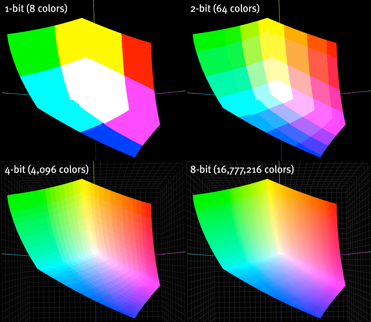
What does Bit Depth really mean?
This is a nice, visual representation of what more bit-depth (the difference between 8-bit and 16-bit scans, for example) really means.
Nods to the Canon site that it comes from, with an extremely geeky explanation of all the details… but for the visually oriented un-geeky amongst us, this says it all.
