Answer: Not hard at all. Really.
There was a time, not long ago, when Color Management was the Next Big Frontier, and using good Color Management was pretty difficult… simply because, honestly, it didn’t work yet. Besides that, the tools were simply out of reach, from a cost standpoint. That, thankfully, is no longer the case. Understanding everything that goes on “under the hood” may still be a challenge for most, but implementing good Color Management and getting predictable results? It’s a piece of cake.
Here’s how it works.
There are five steps.
- Accurate Display.
- Color Settings in Photoshop.
- Color managing in Photoshop.
- Turning off Printer Color Controls.
- Viewing light.
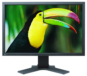 First, you need a good, “color accurate” monitor. Simply, if your monitor can’t display a color, you aren’t going to be able to see it. Make sense? If you’re trying to hear the subtle tones of a Cello on your boom-box, it ain’t gonna happen. You need good speakers. Likewise, if you’re trying to see all the colors in that sunset you just shot on an personal or office-level computer screen, you’re not going to. It’s simply not able to “shoot” that kind of color fidelity. Here’s our favorite line of Color Accurate displays: the Eizo ColorEdge, for one example.
Second. You need to calibrate it. With a good device.
Calibrating a monitor with a good device like the i1 Display, shown here, ensures you’re working with the same standards as every other Graphics or Printing professional out there, if you calibrate it to the common industry standards. Cheaper devices (and frankly, the i1 Display is not a lot of money) will give you inferior results. Calibrating to your own personal preferences will give you unpredictable results. Calibrating it to industry standards with a good device like the i1 Display will guarantee your color-accurate display is, in fact, accurate. (The standards for the printing/photo industry are a Gamma of 2.2, a White Point of 6500K or D65, and a Luminance of 120.)
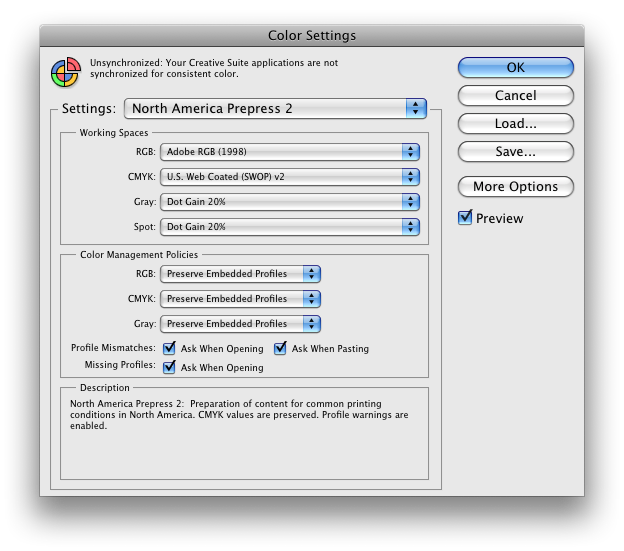 Great… you have a monitor that can display all the colors, and you’ve calibrated it to make sure it is displaying the accurately. Now. How do you make sure Photoshop is working with the color the way it should? Simple. Go into the Color Settings (Edit > Color Settings) and set them to North America Prepress 2. Game over.
Finally, you have to make sure that when you send the file to the printer, you’re controlling where the color is managed. This is where things have gotten a lot simpler… Photoshop and your Operating System, especially on the Apple side, are now talking together. Here’s how that works.
Open a file.
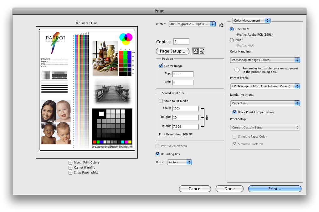
Since you’ve set your color settings in Photoshop correctly, you’re working in Adobe RGB (1998) as a Working Color Space. You hit Print. (File > Print)
You get this screen:
Make sure you’ve selected “Photoshop Manages Color”.
Now, you select the printer/paper/ink profile in the pulldown that says “Printer Profile”. This is not a “close enough” or near-guess case. Your printer profile has to match your printer, your paper, and your inks exactly. 90% of the issues we here from printers stem from using a profile they thought was “close”.
Now you’ve Color Managed your file. You have to let the printer driver know it needs to lay off any additional color adjustments.
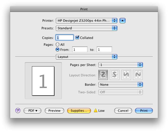
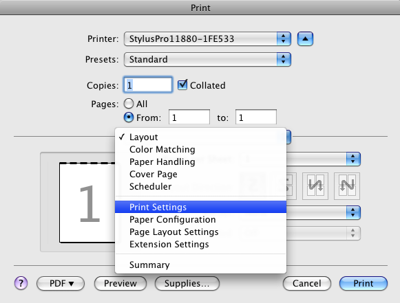
When you hit “Print”, in the more recent versions of software like Photoshop CS5 and Apple Snow Leopard, the setting you just made will turn the Printer Color Management to “Off”. That’s of crucial importance, and where most people goof. Here’s what it should look like. In CS5, the button that says “Page Setup” is different, it will say “Print Settings”. In previous versions you just hit “Print” and, in either case, it takes you to this screen:
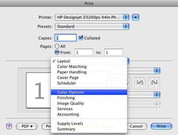
Hit the button that says “Layout” and you’ll get this, where you select “Color Options”:
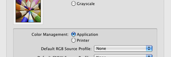
From there, select, for Color Management, “Application”. Hit “Print”, you’re done.
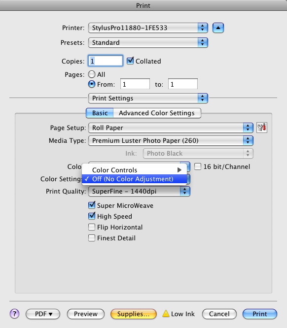
This is shown for the HP Printers, if you’re using Epson, it’s the same process, except you have to make sure that the correct media is set in the Epson Driver. The first selection is called “Print Settings”.
Select that, and set your paper type. Here we’re printing to Premium Luster. Now make sure your Epson Color Controls are set to “Off”, as shown.
You’ve made your print. You’ve successfully, and correctly color managed your process. How hard was that? Are you done? Not quite yet.
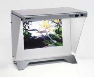 The single piece of the puzzle that goes ignored most often is the viewing light. If you take your nice print and go into your bathroom or kitchen and try to evaluate it there, it’s going to look green. The cool-white fluorescent lights are not white, they’re slightly greenish. If you put it under your halogen desk lamp, it’s going to look brownish-red. If you hold it up to the window, you’re going to get the blue sky lighting the print. Think you don’t need a standard viewing light? Think again, it may well be the single most important part of your workflow.
This is a GTI PDV-e Desktop viewing light. There are several models, of varying sizes, features and prices. You can have all the Color Management in the world at your fingertips, but if you can’t evaluate your prints under some sort of standardized light source, you’re essentially working blind. If you don’t believe it, do this little test. Make a print. Look at it with window light. Now fluorescent lights. And finally, look at it under a halogen track light or desk lamp. The more subtle and neutral the print is, the more dramatically you’re going to see the color shifts.
Now, you’re done.
 It really is just that simple. If you’re interested in learning all the whys and wherefores of how a Color Management system works under the hood and how you can tamper with the controls, there are countless groups, forums, webinars are resources that can lead you down that tortured path. Better yet, you can buy my book. If, however, you just want your prints to come close to what your screen is showing you, then this is all you need to do.
Happy printing!
