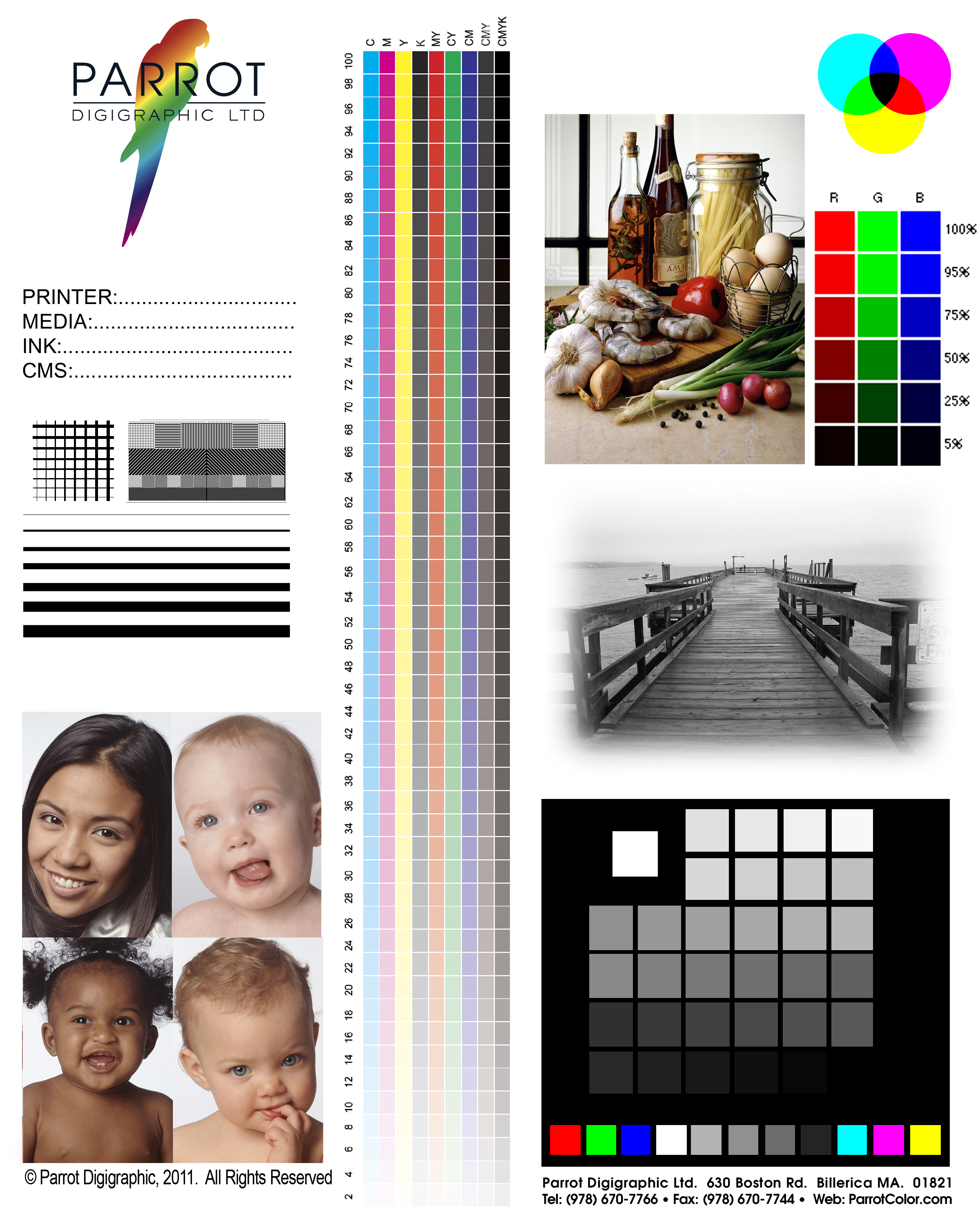
You’ve heard us talk about it. Maybe you’ve even had one of us email you one. Well, now, here’s your own special copy of the Infamous and Notorious Parrot Test3a target! Just click the photo and you can download the full-sized JPEG file in a few short seconds.
Great, you say… but what does it mean?
From the most simple use, it’s just a known target. It’s in Adobe RGB (1998), and we’ve printed it on literally every professional inkjet printing system made since about 1997. We can look at the Parrot Test3a from across the room, and get a feel for whether a printer is behaving itself.
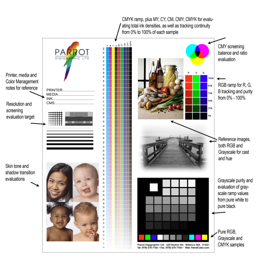
Beyond that, though, it’s a target that we look at very carefully to evaluate a printer, a paper, inks and how a profile is behaving in real-world terms. Here’s a little key to what we look at.
There are a few things we look at right off, and the Grayscale patches in the lower right are the first of them. The bottom row, in particular, tells us how heavy the ink load is on the paper, and if we’re holding a tone into the lowest values. Overall, the Grayscale patches tell us if there’s a hue being introduced into the neutral values, contaminating the basic CMYK ramps of the inks.
What the callouts don’t show you, though, are what you see when you look at the paper. Is it buckling from being over-saturated with ink? Is in nice and even? Can you see through from the back? You can do this with any target, but the Test 3a shows us in a very predicable way.
The sample shots are really there just for an impression of how the tonal values are being reproduced in a more subjective way. That said, those four portraits in the bottom left give you a very accurate impression of the skintone rendering, a tough job, as well as how the tones transition to the deeper shadows. More than a few times we’ve seen distinct banding under the hairlines of those models, or a bright magenta where baby-face pink should be.
It’s most useful for evaluating a new paper, though, for us, but also for you. After you print it a few times, you’re going to start expecting a certain look, and you’re going to see when a new paper strays from that look, for better or worse. Does the print look softer? Snappier? How rich does it appear? That’s a start… but with the Test 3a, we can look under the hood and understand exactly why the paper appears as it does.
Yes… it can get pretty geeky pretty quick. But as we like to say around here… embrace the Inner Geek!

