 …or, “what the heck is a RIP, anyway?”
It’s easy enough to simply explain that a RIP stands for “Raster Image Processor” but that really doesn’t tell you too much- either about what a RIP does, or why you need it. To understand that, you need to get a grasp on the two basic kinds of image files- raster images and vector images.
A raster image is kind of easy- think of a map. Raster images are made up of pixels with actual physical locations- you know how when you’re looking for a street on a map, and the street index says it’s at  C-4? You go to column C, and down to row 4, and you see the street. Raster images are the same deal- every bit of the image is mapped out on a grid of squares. Say you have an image that’s 2500 pixels wide by 1500 pixels high. You have a total of 3,750,000 pixels in your image, and every pixel has a location. It’s called a “bitmap” file sometimes, too- literally a map of the bits of information laid out in two dimensions.
 The thing about a raster image is that, in defining the map of the image, you’re also defining the size. The bigger the image, the bigger the file… you also are limited by how much you can size the image up or down, since you need to re-sample the pixels to get more, or less of them. After a point, you’re image is going to start looking bad.
Now, imagine that you’re trying to describe a square. You could say something like this… “Start here. Go North, 30 feet. Turn East, go 30 feet. Turn South, go another 30 feet. Turn West and walk another 30 feet- you’ll be back where you started.” You’ve just described a square using absolute dimensions, and mapped an area. In effect, you’ve made a raster image of a square.
Try this. Instead of using “feet”, use generic “units” as a describer. Let’s say, you start by saying, go North 30 units, East 30 units, South 30 units and West 30 units. You’ve now described a shape, rather than a volume. Simply by changing the units you’re changing the size of the shape. I can describe a square that’s a few inches, or a few miles in size. 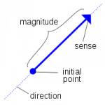
The cool thing about a vector description is that it describes a shape really well… like line art, an illustration, or a typeface. Whenever you have something that needs a simple solid fill, an outline, essentially, it works great. Naturally, it’s not so good at describing what’s inside those shapes, so if you need that kind of information you need a raster image. A vector file has a ton of information, though, and is virtually unlimited in how much it can be scaled. 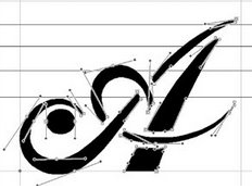
The trick is in turning either of these into something that the printer can make sense of.
A file, like a raster file, that maps out colors for every square of the image translates pretty easily into information that a printer can handle… a printer wants to know what ink, and how much, to put where. The only trick is converting the RGB of a image pixel into the CMYK of a printer’s inks- a process called “dithering”. It’s a little more difficult translating vector information into a file the printer can use- and that’s the function of a RIP. 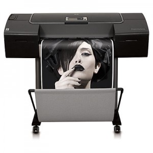
The RIP takes your vector files out of Illustrator, Quark, InDesign or other so-called “Postscript” applications and rasterizes it. That is, it takes the vector information- the shapes- and figures the sizes. It then plots out the pixels so the printer can process the “map” of the image.
A RIP can be a piece of hardware, software running on a workstation or server, or, as in the case of most larger office laser printers, can be built into the printer itself. Interestingly, this is one of the things that sets the HP wide-format inkjet printers apart from the rest of the field- nobody else has an onboard RIP like the Z series “ps” printers.
There are a few other things that a RIP can do, workflow management being a biggie. Built into the RIP is a queue system- the RIP stores and organizes the jobs as they come in. This is a great side-benefit in a high-output print environment. When you have several users sending files, the RIP allows the printer to hold and queue the jobs as they come in. You can also pull jobs that have been printed and send them to the top of the list- making reprints without having to re-open and re-send the file.
It’s just one of the reasons we love our HP Z3200… and recommend them for anyone who’s in a multi-user environment or has to work with illustration or layout programs… workflow management, and seamless integration of Raster Image Processing.
