ParrotTalk

August 25, 2010

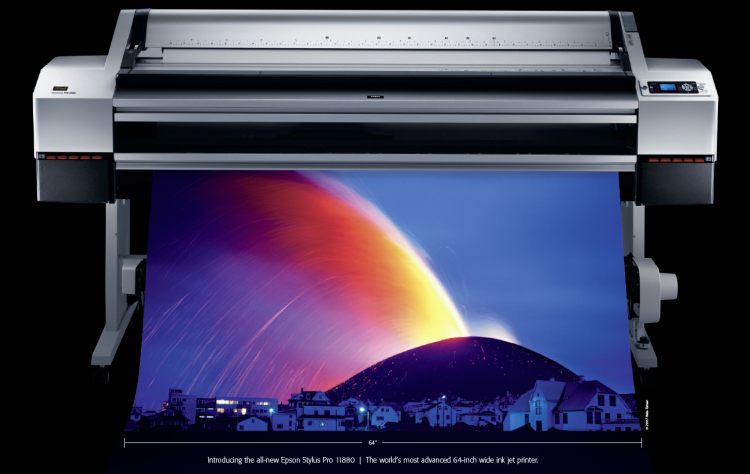
Well, we did it! An Epson 64″ Stylus Pro 11880 at Parrot!

Filed under: Uncategorized — admin @ 3:12 pm

You can’t hardly run a tool like the Cruse Scanner and be limited to old-school ultra-wide printers or 44″ wide printing, now, can you?  We think not.  To keep the stable fresh, we just updated to the best ultra-wide possible.  Introducing the latest and greatest in a 64″ wide printing machine- the Epson Stylus Pro 11880!

This printer has the remarkable Epson UltraChrome K3 with Vivid Magenta inks, the improved MicroPiezo® TFP print head, real-time automatic switching between Matte and Photo Black inks, automatic nozzle verification and cleaning, and more. In Epson’s words: “The result is the world’s most advanced 64-inch wide photographic printer”.  We have to agree!

Combine that with our Angelica and Parrot ultra-wide media and it opens up a whole new world of printing capabilities- scanning and printing oversize paintings and artwork at life-size and bigger.  Whether you’re an artist with huge originals, a gallery looking to produce editions at actual size, or even a commercial lab with 44″ printers and the occasional need for the width of the Stylus Pro 11880, give us a shout, or stop by and see the new baby.  (info@parrotcolor.com)

Here, just for the drool factor, is the list of features from the Epson site:

Nine-Channel MicroPiezo TFP Print Head

  • Print head design capable of handling nine separate ink channels
  • One-inch wide high-performance print head with 360 nozzles per channel
  • Low vibration meniscus control for highly accurate dot shape and placement
  • All-new ink repelling coating to dramatically reduce nozzle clogging

Eight-Color Epson UltraChrome K3™ with Vivid Magenta Ink Technology

  • High-density pigments for an extremely wide color gamut
  • New formulation of Magenta pigments for extreme blues and purples
  • Professional print permanence ratings for truly sellable quality prints
  • High-gloss Microcrystal Encapsulation™ technology for reduced gloss differential
  • Superior scratch resistance from improved pigment and resin chemistry
  • Color is stable immediately after printing – no short-term color shifting
  • Produces a black density up to 2.55 with an L* value of 2.9*
*Data based on Epson Premium Luster Photo Paper (260)

Epson AccuPhoto™ HD Screening Technology

  • Advanced screening algorithm resulting in prints with superior color and clarity
  • Maximum resolution of 2880 x 1440 dpi for incredibly sharp text and line art
  • Extremely accurate fine blends and photographic transitions

Variable-Sized Droplet with TFP Technology

  • Produces variable-sized droplets as small as 3.5 picoliters to greatly decrease print times while optimizing photographic quality
  • Exotic Thin Film Piezo (TFP), along with Low Vibration Meniscus Control technology precisely controls the curvature of every ink droplet within each nozzle before releasing it onto the media. The result is extremely sharp and accurate placement of ink droplets for the ultimate in photographic print quality,

Advanced Black-and-White Printing Technology

  • Unique driver technology takes full advantage of our three-level black system to produce professional black-and-white prints from color or grayscale image files
  • Produces a truly consistent print with no color crossover or color cast
  • Some of the world’s greatest black-and-white photography has been printed using this technology

Automatic Real-time Black Ink Mode Switching

  • Printer utilizes two different black ink modes Photo Black or Matte Black
  • This innovative solution optimizes black ink density for various media types, dramatically improving final print quality

Three-Level Black Ink Technology

  • Simultaneously uses Black, Light Black, and Light Light Black inks
  • Significantly improves the gray balance while eliminating colorcasts
  • Outstanding highlight-to-shadow grayscale accuracy for a smoother tonal range
  • Virtually eliminates any bronzing of the basic pigment chemistry
  • Enhances the ICC profiling process for ColorSync™ and ICM™ workflows

Superior Connectivity

  • Standard connectivity includes one USB 2.0 and one Gigabit Ethernet port
  • Professional Epson Photographic Drivers for Macintosh® and Windows®
  • Fully supported by most leading third party RIPs and workflows

Professional Media Handling with Automatic Roll Media Take-Up Reel

  • Prints on virtually any media type, in roll or cut sheet, up to 64-inches wide
  • All media is front-loaded via a unique straight-through media path
  • Accurate automatic loading of cut sheet media up to 64-inches wide in a variety of weights up to 1.5mm thick posterboard
  • User-adjustable Roll Media Spindle accepts either 2-inch or 3-inch media cores
  • Produces impositions based upon a work-and-turn process, allowing for printing on both sides of certain media types
  • Built-in Automatic Cutting System supporting most media types
  • Standard Automatic Roll Media Take-up Reel for unattended production of long print runs
  • Optional Retractable Fabric-Based Media Bin safely captures multiple prints up to 64″ x 36″

Automatic Media Bar Code Tracking and Identification System

  • System automatically tracks media type, remaining length, media width, etc.
  • Data is stored within the barcode and printed at the edge of the roll before unloading
  • Reloading partially reused media rolls is now very efficient with less chance for mistakes

Epson Intelligent High-Capacity Ink System

  • Pressurized ink cartridge technology ensures reliable ink delivery at all printer speeds, while dramatically reducing the physical size of the ink cartridges
  • Nine individual 700ml (fill vol.) ink cartridges
  • On-the-fly ink cartridge replacement for increased productivity

Unique Printer Activity Lighting System

  • Nine individual amber LED lights provide live feedback about ink and printer activity

Automatic Head Alignment

  • Built-in sensor reads printed data for highly precise alignments of all color channels
  • Aligns both single and bi-directional print modes

Automatic Nozzle Verification and Cleaning

  • Embedded sensors quickly verify nozzle status without using media
  • System automatically performs a head cleaning if required
  • Nozzle verification is performed in under 30 seconds
  • Nozzle verification process consumes less than 1 ml of ink
  • Can be set to automatically perform check before each job; periodically;
    or can be turned off

True BorderFree™ Roll-Based Printing

  • Capable of printing off both left and right edges of roll based media (up to 54″ wide), while automatically cutting top and bottom edges to produce a full-bleed print on all four sides
  • Fully trims finished prints more accurately and safely than by hand

High Performance Print Engine Speeds

Utilizing our latest print head technology, the Epson Stylus Pro 11880 printer is among the fastest wide-format printers in the industry.
Print Mode 16″ x 20″ 20″ x 30″ 40″ x 60″
Normal – 360 dpi HS 0:50 1:24 4:08
Fine – 720 dpi HS 3:09 6:19 19:45
SuperFine – 1440 dpi HS 4:42 8:17 25:52
SuperPhoto – 2880 dpi HS 7:39 13:24 42:10

* HS = High-Speed Print Mode (Bi-directional Print Mode) | Print speeds are shown in min:sec

Based upon print engine speed only. Total throughput times depend upon front-end driver, RIP, file size, printer resolution, ink coverage, networking, etc.

Epson PreciseColor™ Manufacturing

  • Unique production technology to ensure printer-to-printer color consistency
  • Colorimetric calibration is performed during the manufacturing process
  • This process automatically evaluates and adjusts the color performance of each printer
  • The result is extreme color repeatability for demanding color performance over time
  • Completely eliminates the need for internal printer calibration devices or procedures
August 12, 2010

Paper Glossary- more, from Legion Papers

Filed under: Uncategorized — admin @ 2:49 pm

Not to be outdone by Ron Martinson and his awesome glossary of printing terms, we dug up the Legion Paper pdf from their site and double-checked to see that there was nothing missing.  We have a few notable, and some not-so-notable (read: extremely paper-geeky) additions.

Here you go, this excerpt, courtesy of our friends at Legion:

Buffering -The neutralizing of acids in paper by adding an alkaline substance (usually calcium carbonate or magnesium carbonate) into the paper pulp. The buf­fer acts as a protection from the acid in the paper or from pollution in the environment.

Calcium Carbonate -An alkaline chemical used as a buffering in papers and boards.

Cellulose -The chief constituent of the cell walls of all plants. All plants contain tissue that, when properly processed, will yield cellulose. Cotton in its raw state contains about 91% and is the purest form of natural cellulose. Other sources for papermaking include hemp (77%), softwoods and hardwoods (57% to 65%), and kozo (66% to 77%.)

Chain Lines -The lines visible on laid paper, parallel with the grain direction, usually about one inch apart.

Cold Pressed -A paper surface with slight texture produced by pressing the finished sheet between cold cylinders.

Cotton Linters -Fibers that adhere to cottonseed after ginning. Used as raw mate­rial to produce pulp for cotton fibre content papers.

Cylinder Machine -A papermaking machine in which a wire covered cylinder rotates partly submerged in a vat containing dilute paper stock. The sheet is formed on the outside of the wire as the water drains throughout. The paper is lifted from the wire by an endless felt. Also referred to as a mould machine or cylinder mould machine. “Mouldmade” paper is made on a cylinder machine.

Dimensional Stability -The degree to which a paper will maintain its size and shape when subjected to changes in moisture content and relative humidity. Very important in maintaining registration in printing.

Dye -Colored soluable substance that imparts a more or less permanent color to another material by staining or by chemical reaction with substrate.

FeltSide -The top side of the paper and side usually recommended for best printing results.

Formation -The arrangement of fibers in a sheet of paper, which can be seen by holding a sheet of paper to a light source. The formation of the sheet is determined by composition of the fibers, fiber length, machine speed and shake, amount of filler and other factors. Formation can run from “tight” or “close” to “wild” and is a major factor in determining how the sheet will perform, affecting factors like levelness, strength and dimensional stability.

Handmade Paper -Paper made by hand using a mould-a frame which is covered with a flat rigid screen (Western) or flexible screen (Oriental). In both cases, the mould is covered by a flat frame called a deckle to contain the run-off of wet pulp, dipped into a vat of wet pulp, shaken to distribute the fibers evenly and drained of its excess water. The wet mat of fibers remaining is the newly formed sheet, which is then dried against blankets & may be hot pressed, cold pressed, or air dried.

High Alpha Cellulose -A very pure form of wood pulp which is considered to have the same longevity as cotton or other plant fibers.

Lignin -A component of the cell walls of plants that occurs naturally, along with cellulose. Lignin is largely responsible for the strength and rigidity of plants, but its presence in paper is believed to contribute to chemical degradation. To a large extent, Lignin can be removed during manufacture.of Terms Continued

Pulp -Any cellulose plant fiber (cotton, linen, wood, Japanese plants) cleaned and beaten into a wet mixture used to form sheets of paper.

pH -In chemistry, pH is a measure of the concentration of hydrogen ions in a solu­tion, which is a measure of acidity or alka­linity. The pH scale runs from 0 to 14 and each number indicates a ten-fold increase. Seven is pH neutral: numbers below 7 indi­cate increasing acidity, with 1 being most acid. Numbers above 7 indicate increasing alkalinity with 14 being the most alkaline. Paper with a pH below 5 is considered highly acidic. Buffered papers typically have a pH between 8.5 and 9.5.

Porosity -The porosity is an indication of the openness of the paper, as measured by resistance to the passage of air through the sheet. Two types of instruments are gener­ally used to measure porosity-Gurley and Sheffield. The Gurley instrument measures the seconds required for a given volume of air to pass through a single sheet and is generally used for porous papers. A high reading indicates a less porous (or more dense) paper. Sheffield porosity measures the flow rate of air through a single sheet and is generally used for non-porous or dense sheets. A high Sheffield reading indicates a more open paper. A typical Gurley porosity test for 50 lb. smooth offset would be 10-20 seconds. Sheffield readings of 60 lb. coated paper would be 10-20 units of air flow.

Recycled Paper -Paper made from pre and post consumer waste. Used paper is cooked in chemicals, de-inked and reduced back to pulp, which is then used to manufacture new paper.

Rice Paper -A common misnomer used to describe Oriental papers. There are no papers made from rice, although rice starch was traditionally used to size papers made of Kozo (mulberry plant), Gampi, or Mitsumata.

Rough -A heavily textured paper surface pro­duced by placing wet sheets of paper against textured blankets or air drying (or both)

Sulphite -Sulphite pulp is produced from the wood of coniferous trees. Wood chips are cooked in calcium bisulphate or sodium sulphite, and bleached, producing fairly long strong fibers. Since the end of the 1860’s, until recent years, it has been the most widely used pulp in America. In fact, the term “sulphite” has become generic and is still accurately used to describe any paper made from wood in distinction from papers made from cotton or other fibers. Sulphite pulp is available in a range of grades up to pure alpha cellulose.

Tear -The test is valuable to the papermaker in determining the uniformity of refin­ing the length of formation of fibers. Tear strength can be important to the printer or converter, especially when bags, maps, children’s books, etc., are involved. Determines average force in grams required to tear a single sheet after the tear has started. An Elmendorf tearing tester, employing a falling pendulum, is used with the test made in both machine and cross directions.

Tensile Strength -A test more important to the mill and pressure sensitive label converters than to the printer. Tensile strength is related to burst and tearing strength, and the combination of the two tests is often used as an indication of the inherent tensile strength. Some degree of stretch is usually desirable in paper and reflects a certain degree of elasticity which tends to minimize breaks and ruptures. (This stretch should not be confused with the stretch and shrink normally resulting from a change in moisture content.)

Vellum -A paper surface that is finely textural. Vellum is also used to designate heavy weight, translucent drawing or draft­ing papers.

Waterleaf -A paper with no sizing. Very absorbent.i.e. Blotting Paper.

Wax Pick -Important in checking surface strength that could affect linting and picking. Sticks of special wax of varying adhesive strengths (made by Dennison and rated 2A to 26A) are melted and applied to a sheet then pulled off when cool. The result is reported as the highest number wax that does not disturb the surface of the sheet. (This test should not be attempted on loose­ly felted papers or on coated papers contain­ing thermoplastic resins.) While the wax pick test is still widely used in the industry, its limited application has led to the use of other devices, particularly on coated papers.

Wove Paper -Papers which show no fine “laid” lines running through the sheet when held to the light.

…in addition to all that, there’s a continued glossary of general digital imaging terms.  See the Legion Paper main catalog/info sheet page here: Legion Papers

While you’re there if you see anything you like, shoot us an email for our pricing!

August 11, 2010

The Cruse Scanner and Lighting- an Explanation

Filed under: Uncategorized — admin @ 10:18 am

The Synchron lighting on the Cruse Scanner is arguably the most powerful piece of the entire puzzle.  Whenever you try to light a large area with conventional lighting you’re fighting basic Physics- notably the Inverse Square Law.  In case you slept through that class, (as I did), here’s the rundown: Light intensity is inversely proportional to the square of the distance from the light source.  Want it in plain English?  Light intensity, or brightness, drops off really really fast as you move away from the light.  If you’re lighting an area that is four feet across, and have a light source set up on one side, the nearest side is going to get a ton more light than the far side.  If you have two lights, one on either side, as most copy setups are designed, it helps, but just by overlapping two uneven spreads of light, and trying to cancel out each spread’s unevenness.

With the Cruse, you’re working with long, strip lights that are even from end to end.  In addition, every point of sampling in the entire scan is the same distance from the light source- simply because the work moves under the lights.  Every single sample point in the entire piece is, say, 12″ from the light bank.  You can’t get more even than that.

So here’s the challenge.  We want to side-light a painting so we can see shadow and highlight on the brush stroke.  If we light it with a conventional copy setup, you’re going to have a big bank of lights on one side, and the piece is going to be brighter on one side and darker on the other. The only way to fix that is with Photoshop, or a program that is specially designed to even out uneven lighting.  Not with the Cruse.

Here’s a sample of what the lighting looks like, using the left bank of the Cruse Synchron lights:

Perfect- we get nice side-lighting on the brush strokes (actually top lighting, from the point of view of the painting…).  But is it even across the whole painting?  Take a look.

Not only the whole painting is within a couple of points, but the entire bed of the scanner- 48″ x 72″- holds incredibly tight tolerances.  Not only that- it does it every time.  You don’t fuss with lights and hope for the best- the system is set up and calibrated to be spot-on.

August 6, 2010

Some weekend reading- Digital Printing Glossary (Ron Martinson)

Filed under: Uncategorized — admin @ 4:41 pm

From Ron Martinson’s blog, probably the most complete collection of digital printing terms we’ve seen.

Here’s a sample:

“Achromatic- Black, white and greys. Artwork that is executed without color. Also called monochromatic.

AP- Abbreviation for artist’s proof.

Archival- Term with no definitive scientific meaning.

Artist’s Proof- Traditionally, proofs pulled by the artist over and beyond the regular numbered edition, reserved for the artist’s use. Now often used to designate any proofs pulled over and beyond the regular edition, whether printed by the artist or by his printer, but reserved for the artist’s use.

Basis Weight- In the United States and Canada, the weight, in pounds, of a ream (500 sheets) of paper cut to the basic size. Also called ream weight and substance weight (sub weight). In countries using ISO paper sizes, the weight, in grams, of one square meter of paper. Also called grammage and ream weight.

Bleed- To extend the print image to the edges of the paper.

Brightness/Whiteness- Brightness is a measurement originally developed to monitor pulp bleaching. There are two predominant scales for conveying brightness: GE and European. Whiteness is a measurement taken by shining a bright light source onto a sample of paper. An electronic sensor takes a reading of the color of the reflected light—or whiteness.

Bronzing- The effect of seeing a flash of bronze color reflecting off pigment inks. Sometimes confused with gloss differential.

Calendering- The process of smoothing the surface of the paper by pressing it between rollers. Uncalendered papers — those not made smooth by calendering — have a less smooth texture.

Caliper- The measurement of thickness of paper expressed in thousandths of an inch or mils (millimeters).

Carbon black- A pigment made of elemental carbon and ash.”

…and so on.

Great stuff, and a resource we’ll be referring to for years to come. Thanks Ron!

July 28, 2010

The Power of Layers and Masks…

Filed under: Uncategorized — admin @ 10:23 am

(…to be used only for Good, never for Evil!)

I’m a big proponent of Layers and Masks- as I often repeat in my books and classes, it’s a simple tool that, once mastered, can be used for almost anything you need to do in Photoshop.  I use them constantly in my Smart Object RAW workflow, but here’s an interesting example of how they can be used to apply a massive edit to selected areas in a very short amount of time.

We had a job in a while back that required the “smoothing” of almost every area of color.  The artist, once he saw what we could do with the solid areas of color he used, decided to ask us to recreate the entire work as a new style- almost duplicating the effect of a serigraph, with solid planes of pure color.  We did feel, however, that some feel for the brush stroke had to be kept.  It was a delicate balance.

Not only that, but, as you can imagine, the first pieces we did took an astounding amount of time to retouch- in the neighborhood of sx hours per piece.  We had to develop a method to work more efficiently.

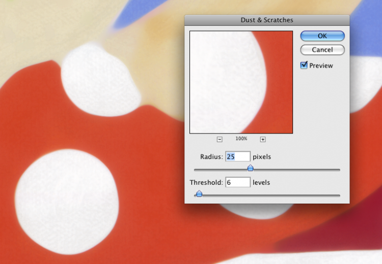
Enter: Layers and Masks, combined with the Dust and Scratches filter.

Here’s what the pieces looked like, right out of the Cruse scanner.

You can see the blotches and brush marks the artist was objecting to.  Our first step was to apply the Dust and Scratch filter to a duplicate layer- like this:

You get there like this- Filter>Noise>Dust and Scratches.

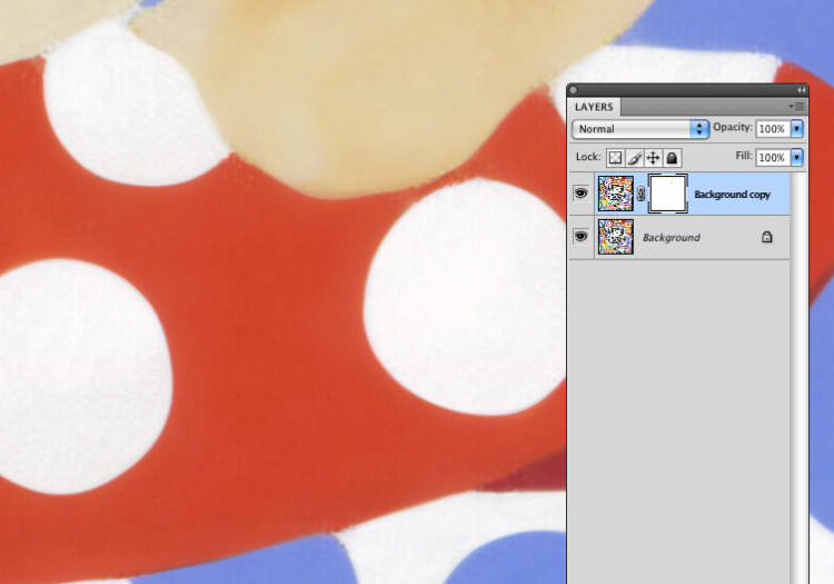
As you can see, this created some problems along many of the borders of the color fields.  Here’s where we used a mask on the layer to control where, and how much of the effect we were going to apply.

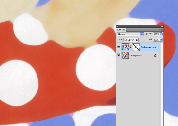
Selecting the Dust and Scratches layer, you click the Mask icon and get a new, clear mask.  I like to use the Brush tool, set to black, with an Opacity and Flow of 50% each…  I then simply paint on the mask over the areas that I want to become opaque.  Remember- white is transparent, black is opaque.

Here’s what we get:

Just for the sake of comparison, here’s the same thing, with the mask turned off:

The process, after going through each area of the print and touching the edges, the details, and some of the fields, took around 2 hours per image for a 40″ x 40″ square painting…  yielding around 4 hours of time saved, and a better quality result.

As in most of Photoshop, there are about six ways to accomplish anything…  much of the challenge in using the program is to find the best way to attempt a new task.  I’ve found, time and time again, I always come back to the basic Layers and Masks, and it hasn’t let me down yet!

-Ted Dillard

July 23, 2010

Fluid-Mount Scans- Why We Use It, Why You Need It

Filed under: Uncategorized — admin @ 11:15 am

With the advent of desktop film scanners back in the mid-’90s a lot of photographers took on the task of scanning their own film instead of outsourcing the job to a drum scanning service. The scans coming from these scanners were quite serviceable for web work and some limited print- mostly small, short-run inkjet- purposes. As low-end flat-bed scanners improve, many studio and small lab based systems have improved to the point of almost replacing the fluid-mount drum scan.

Almost.

There are a few things about fluid mounting that simply take you head-and-shoulders above what you can get without it.  Probably most importantly, as a general rule any scanner that supports fluid mounting properly is starting off with an ultra-high resolution system, and an ultra-high DMax (or density) capability.  Even without fluid mount, you’re using better hardware.  It should be better- the cost is in the tens-of-thousands of dollars for these systems, and, as always in imaging technology, “…you get what you pay for.” has never been a truer statement.

One of the interesting things that happens when you use a fluid-mount system is that the film’s density becomes more readable by any scanner.  Back when flatbed scanners were starting to become serious tools, more than a few people I know started using drum-scanning fluid (then, basically straight mineral oil) on their flatbed scanners…  they got a vast improvement in the apparent DMax.  A few of them also destroyed their scanners with oil dripping into the guts…  ultimately a pretty expensive “hack”.

One of the most significant reasons we use fluid, however, centers around the actual physical condition and properties of the film itself.

There are a few things you’re wrestling with when you use a scanner for film.  The first issue centers around the surfaces where the film touches the glass platen.  Every surface you add to the equation introduced the possibility of dust and scratches- things that will be picked up by the scanner.  You also have to worry about Newton rings- a natural phenomenon that happens whenever two glossy surfaces come in contact, resulting in a prism effect in concentric circles.  The common method to overcome this is to use an “anti-Newton” glass- a method that also softens the scan slightly.  Using a fluid-mount system eliminates virtually all of these problems.  The fluid prevents the formation of Newton rings.  It also literally fills in scratches and surface imperfections.  If dust is present, it will, of course, scan- but there’s a significant amount less dust with fluid because there’s no static attracting it to the surface of the film or the glass.

Most film brought to us is not particularly, well, recent.  Often we’re scanning film that’s been in an archive, most of it thankfully has been stored properly and is in pretty good shape.  Some of it, however, may have started out in the notorious “shoebox” filing system we’ve all been guilty of, and even film coming directly from the lab has a decent chance of having small scratches and embedded dust present.  When you’re scanning at a true optical resolution of 5000 dpi and higher, you’re going to see it.

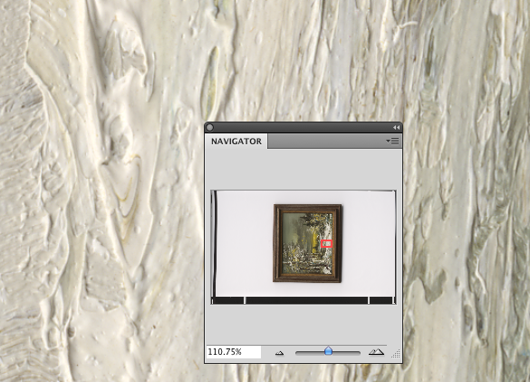
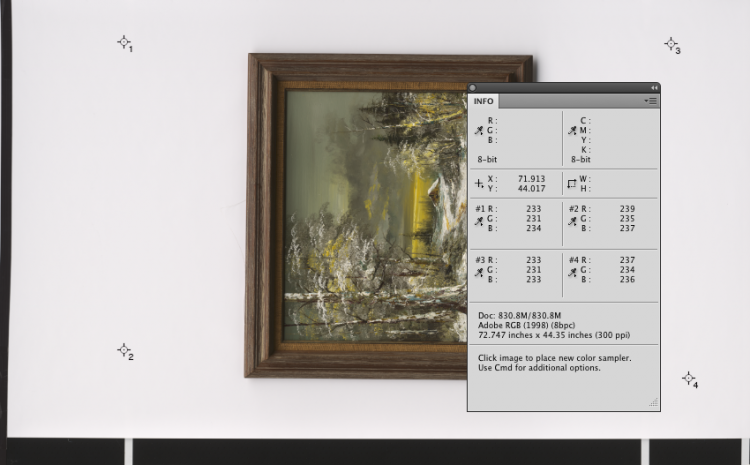
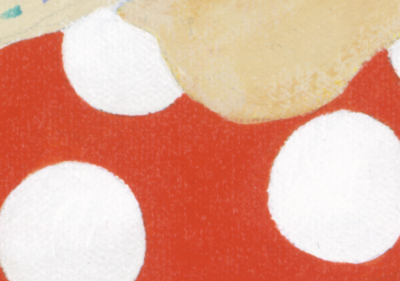
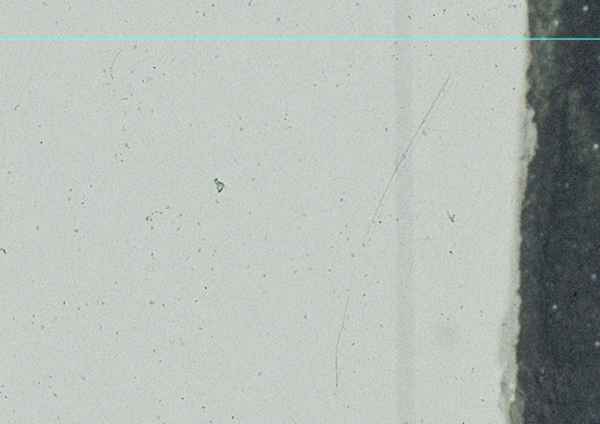
Just for example, here is a scan we did on our iQsmart of a transparency without fluid mounting.  (The visible Guide is there in Photoshop so we could locate the spot accurately, and we’re viewing this from a 2500dpi scan at 100%.)

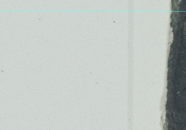
In particular, note the small scratch on the right-hand side of the selection.  Now look at what you get with a fluid mount:

Same area, we literally just fluid-mounted the chrome without moving it.

As you can see, and everything else aside, fluid mounting saves you an enormous pile of time when you’re retouching flaws in the image, preparing it for printing.  The older, more abused, dirty or damaged a piece of film is, the more you need to use fluid mounting.  On a chrome in good condition, though, you often eliminate the need to do any spotting entirely.

Fluid mounting started out using mineral oil- it was relatively easy to clean off the film after the scan, though the common practice was still to re-wash the film to remove any residue.  Today we’re using fluids that are much safer for the film.  They’re more volatile- they evaporate quickly, and don’t leave reside- as well as being less corrosive to delicate emulsions.  For example, our LUMINA Optical Super Scanning Fluids are what we prefer for the safest handling of the film, and fast, easy cleanup.

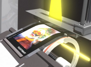
Hasselblad continues to produce the Flexframe scanners using what they call “Virtual Drum” scanning technology.  This uses no glass- the film is held in a frame that is tracked in a slight arc as it scans, allowing the lens to focus precisely at the film plane without introducing glass surfaces and associated dust and Newton rings.  They use the highest level of optics and sensors giving you some of the highest density and resolution- and it’s a great idea from an engineering standpoint.  But…  because you’re not using fluid, you’re stuck with all the surface imperfections on the material.  Not so great from a retouching standpoint.

You’re also seeing some offerings of mid- to low-priced scanners with added fluid mount capabilities.  Unfortunately, they’re not really built for fluid, more sort-of adapted for fluid, and we’ve seen and heard of a few getting damaged by leaking oil…  in addition, they’re starting out with less than optimum hardware, generally in the optics.  In this price point be very wary of specification claims, in particular for resolution.  In some specific cases, you have low-end optics, but with very high optical resolution.  Unfortunately, sheer resolution isn’t the last word in lens design- contrast and clarity play a big role, and that kind of performance costs money. You simply can’t compare the scans from a $700 scanner to those of scanners costing over $20,000- period.

In the final analysis, we’re back to the beginning of the story.  The desktop scanners are great for what they’re meant to do, but, as with so many things, if you’re starting with a better scan using the right methods, you’re going to end up with a better print- after a lot less work.

July 15, 2010

Project Diary- Scanning Pinball with the Cruse

Filed under: Uncategorized — admin @ 10:11 am

We get a lot of interesting projects in, here’s a cool one- Jim Heck, of Classic Playfield Reproductions brings in a vintage pinball table for us to scan!

July 14, 2010

The Display Question Redux: What Display Should I Buy?

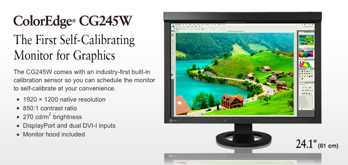
With the release of the Eizo CG245W self-calibrating display, the photo/printing forums are buzzing anew on what is probably the most often-posted question online: “What display is the best one for me?”  Well, for me the answer is, “It depends…”

The way I usually talk about displays is with my music analogy.  If you have a nice home audio system and you like listening to Classical music, you buy speakers that can faithfully reproduce that sound.  If you like to listen to a cello, you’ve got to have a system that can reproduce that “cello sound”.  If you have speakers that can’t make that sound, you’re not going to hear it (no matter how good the rest of the system is…).  Likewise, if you need to work on colors that your display can’t show, then you’re literally working blind.

Point #2 is calibration.  The oft-asked question is, “…how do I know that what I see on my display is what my client sees?”  Simply, you don’t.  However, if you have a good display that is calibrated to the industry standard (Gamma- 2.2, White Point- 6500K, Luminance- 180) and your client does too, then you’re going to be seeing essentially the same thing.  Calibration is absolutely critical to this working effectively.

Finally, there’s personal, well, comfort, for lack of a better word.  A friend said to me once, a very long time ago: “Look.  The monitor is the one thing that’s in your face every day, for most of the day.  Put your money into the display.  Period.”  I have to say, that was some of the best advice I got, and I still swear by it.  The one thing is the size/color tradeoff, though.  I love a big display- the Apple 30″ Cinema is possibly my most favorite workhorse- simply because it’s huge.  Big displays let you work faster.  It’s a fact.  But I like a more color-accurate display too, like the Eizo or Lacie, or the NEC graphics series…  so it’s a tough call.  For the same money I can get a smaller, extremely accurate display or a big, “decent” display like the Cinema.

Our buddy David Saffir has a great post on his blog about the new “Wide Gamut” displays- check it out via davidsaffir.wordpress.com. He’s writing from a photographer’s perspective, but anyone printing digitally can pick up some good information there.  David also does some great printmaking-oriented workshops as well, specifically dealing with the importance of Color Management- display calibration and printer profiling-  one of which was the HP DreamColor II Workshop we hosted here at Parrot.

…and yes.  We’re planning the next one real soon!

June 24, 2010

Welcome to ParrotTalk!

Filed under: Uncategorized — admin @ 4:26 pm

Welcome to the Parrot Digigraphic blog, ParrotTalk!

Here we have a good array of tech support tips, such as how to install your custom Parrot or Angelica paper profiles, how to make sure your color settings are in good order in Photoshop, some ramblings about photography, art and printing, and even some of our little secrets- (yes, even the Printer Repair Cat!)

You can use the Search feature to find what you need, or simply scroll through the listings on the right. Never hesitate to contact us if you don’t find what you’re looking for…

Thanks for stopping by, we welcome your comments!

- The team at Parrot Digigraphic

June 23, 2010

The Paradox of Palette: Black-and-White Digital Photography

Art, for all arguments and discussions, is about expression. Artistic expression throughout history is as linked to the medium as it is to the artist. Even if we look back to prehistoric artists, making images of animals on caves in Lascaux, the work we see is a melding of the artist’s vision and the tools at hand. The beauty found in these primitive cave paintings is not only about the colors and forms—it is about the ability of the artist to express these forms, feelings, and sense of the subject using the simplest tools and pigments.

I have a favorite story about Pablo Picasso. The story goes that he was living in Paris, and for a while was short on money. He had developed a following, and he could sit down in a café and pay for his meal by dashing off a simple drawing with a pencil on a scrap of paper. Picasso was, among other things, a master of line. I can only imagine those sketches—I’m not sure if any survived, but I have been fortunate enough to see (and photograph for the collector) Henri Matisse’s personal collection, including some very personal drawings by Picasso, almost nothing more than doodles on the back of a finished work. They were beautiful in their innocence and simplicity, but also their expression. These works possess an undeniable mystery precisely because they are so compelling and expressive. Four simple lines on a piece of paper can elicit the beauty and mystery of the human form.

The black-and-white medium was the essence of photography for a very long time. It may be surprising to learn that the first known permanent color photograph was taken by James Clerk Maxwell as early as 1861—a mere 40 years after Joseph Niépce created the first photographs. It wasn’t until 1935—and the introduction of Kodachrome—that color became a viable, popular medium.

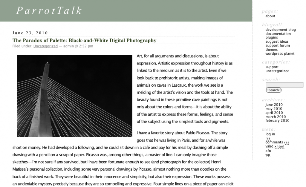
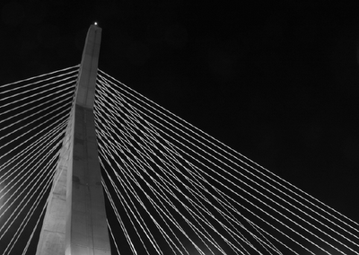
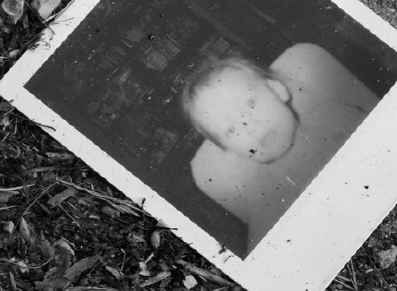
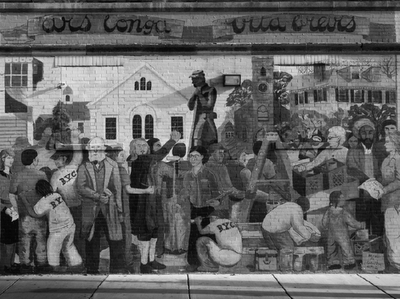
Black-and-white photographs as fine art are often distinguished as “expressive,” “sensitive,” and “creative.” Why is this? It is the limits of the medium and the photographer’s ability to work within those limitations to express a vision. Much of the power of a black-and-white image lies not in its representation of reality, but in its interpretation of reality at the hands of the artist.

And here is the first rub in photography: Photography, especially color photography, is commonly described as realistic. Colors are said to be “lifelike,” “true,” and “real.” An image is often trusted—and, I would argue, mistrusted—to be a representation of reality. Right there is the issue with photography as fine art: If a medium is reality, then how can it also be an expression of the artist’s vision?

By its very nature, black-and-white photography neatly skirts this issue. The fact that a black-and-white photograph represents colors with shades of gray makes it an interpretation, rather than a mirroring, of what the artist sees. It is the simplification of the palette and the limitations of the medium that give the image its power of expression. Take this one more step, into the world of digital photography. We now have a tool—Adobe Photoshop—that has almost unlimited power in producing images and effects that mimic and recreate “reality.” We are able to create photographs with as much color depth as our eyes can perceive and print them with a larger range of colors (or gamut), more than we ever could achieve in the traditional darkroom. We can record the world with astounding fidelity.

One of the beautiful things about digital photography, and the RAW file in particular, is that our creative process has shifted more to the act of combining pieces of an image rather than capturing the image, the negative, and working with what you’ve captured. I can make a digital photograph in color and reproduce it in color, black and white, or any other interpretation of that original image by manipulating the RAW file. Throughout this discussion of the various techniques and processes of digital black-and white photography, you’re going to have to decide exactly how much you want the medium to limit you, and how you’ll use that limitation to fulfill your vision. Whether you shoot in full color and control the image throughout the RAW process and subsequent image adjustments, or you use a camera that can only shoot in black and white (a “dedicated grayscale” camera), you will learn to harness its limitations.

It’s a decision you have to be aware of, learn about, and make for yourself.

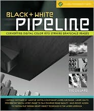
(Excerpt from Black and White Pipeline – Lark Books)

-Ted Dillard

« Newer PostsOlder Posts »

Powered by WordPress