ParrotTalk

October 26, 2011

Fine Art Reproduction: How to Do It Right

Filed under: Uncategorized — admin @ 9:36 am

Let’s assume we’re in agreement- all this time we’ve been doing it wrong.  How do we do it right?  Let’s do two things to start out.  Let’s set some goals, and let’s break this down into two parts: viewing the painting or print, and making the capture.

Viewing the Art

The lighting used for viewing the original painting, or the final reproduction, is probably the facet of the process that we have the least control over.  Once the print leaves our hands (or, for that matter, the painting leaves the hands of the artist) we really don’t have much to say about how it is displayed or lit.  Museums and galleries have some very tough challenges lighting work in a practical way.  As we’ve seen, this can be critical in how the print is perceived and interpreted.  There are, however, a few things we can do to establish attainable goals.  Simply, we can reproduce the painting as faithfully as possible, matching the color and contrast to the best of our capabilities and within the limits of our equipment.

One of the keys to achieving that is to view, and match, the original paintings and the proof prints under lighting that is as close to the artist’s studio as possible.  If the original was created in a North-light studio we’d prefer to evaluate our prints with lighting that comes as close as possible to the quality and wavelength of North light.  Likewise, if the artist works with halogen spots trained on the work, we should view the prints with light that is the same- gallery-style halogen spots.  The reasoning behind this is that every pigment or dye reflects light in a characteristic way.  Paint will look slightly different than our printer’s ink under quartz lighting and North daylight.  It may be dramatic, or subtle, but to get as close as possible to experiencing the vision of the artist, you need to view and match your final print under the same light that the artist used, with the original work lit identically. Only then can you really claim the print is faithful to the original.

Lighting and Capturing the Original

Let’s start with the most difficult goal.  Let’s think about how we’d light and capture the painting as the artist saw it.  The key to this is to recreate the light in the artist’s studio, down to the last detail.  Bear with me…  this is far from practical, but it’s a good exercise in understanding what the challenges are.

We would have to map out the location and size of the windows in the artist’s studio, and recreate them in the photo studio.  This includes size, distance from the painting, height, angle…  and would mean we’d either have to create light sources from daylight-balanced continuous, or strobe light sources.  Remember, the wavelength, or color, of the light source is critically important to assure we’re reflecting the colors of the original correctly. The background walls are equally important.  In Rembrandt’s studio we saw background walls with a warm tone.  This will effect our “fill” light- the light that illuminates the shadows in the painting, such as under the brush strokes.  The “main” light provides our primary color balance and illumination.  The “fill” light provides the background light, illuminating (or contaminating, if you will) the areas not affected by the main light.

In essence, we’d have to build a complete “set”, like a movie or stage, of the artist’s studio with our artificial light.

Suppose, for a minute, that we could simply bring our gear into the artist’s studio and photograph it with the very light the artist used.  This is certainly possible, but there’s one technical issue- the intensity of light in a North-light studio.  Although sufficient for painting, the level of light a North-light studio is at the very lowest levels necessary for making a good camera exposure.  This affects everything from color mapping to resolution.  The more we have to amplify the sensitivity of a digital camera, the less we get in terms of resolution and true color fidelity.  The actual studio is simply not bright enough.

So let’s scale back our goals a little, and try to simply get closer to what the artist saw than the standard copy practices.  We are looking for soft side and top-lighting with an open shadow.  Again, we can do this with a very large bank of strobes or continuous daylight balanced lights with diffuser panels (such as soft boxes), approaching the size and position of the original studio.  They have to be a fairly good distance from the painting to assure even coverage of the work.  If they’re too close, you’ll see variation in the light intensity from one side or another, or from top to bottom.  When you move the lights further away you compensate for how fast the intensity drops off over the distance from the closest part of the painting to the furthest.  (For more explanation of this, see this link on the Inverse Square Law.)  The rub is that, again due to the Inverse Square Law, as you move the lights further away, the intensity drops dramatically.  To use large banks of lights at the same distance as the original windows you’re going to have to pump huge amounts of power into those lights.

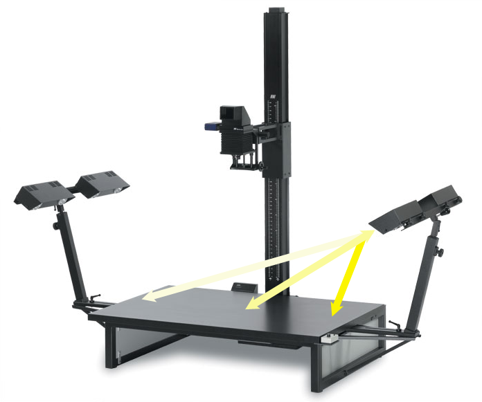
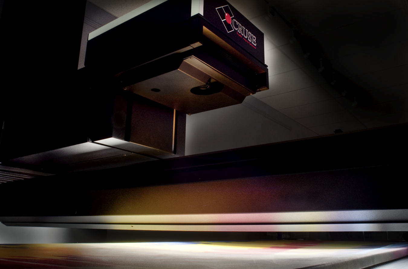
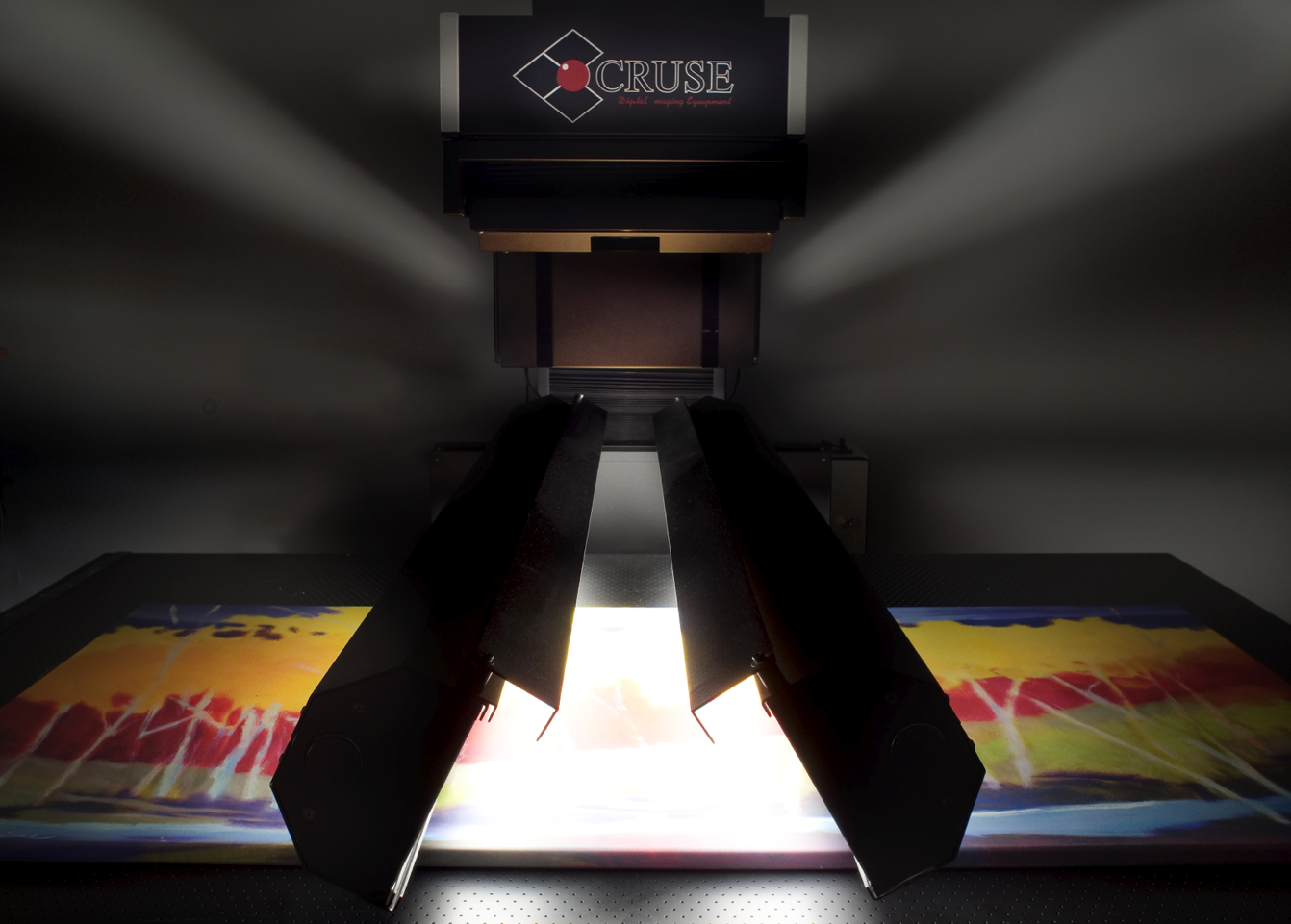
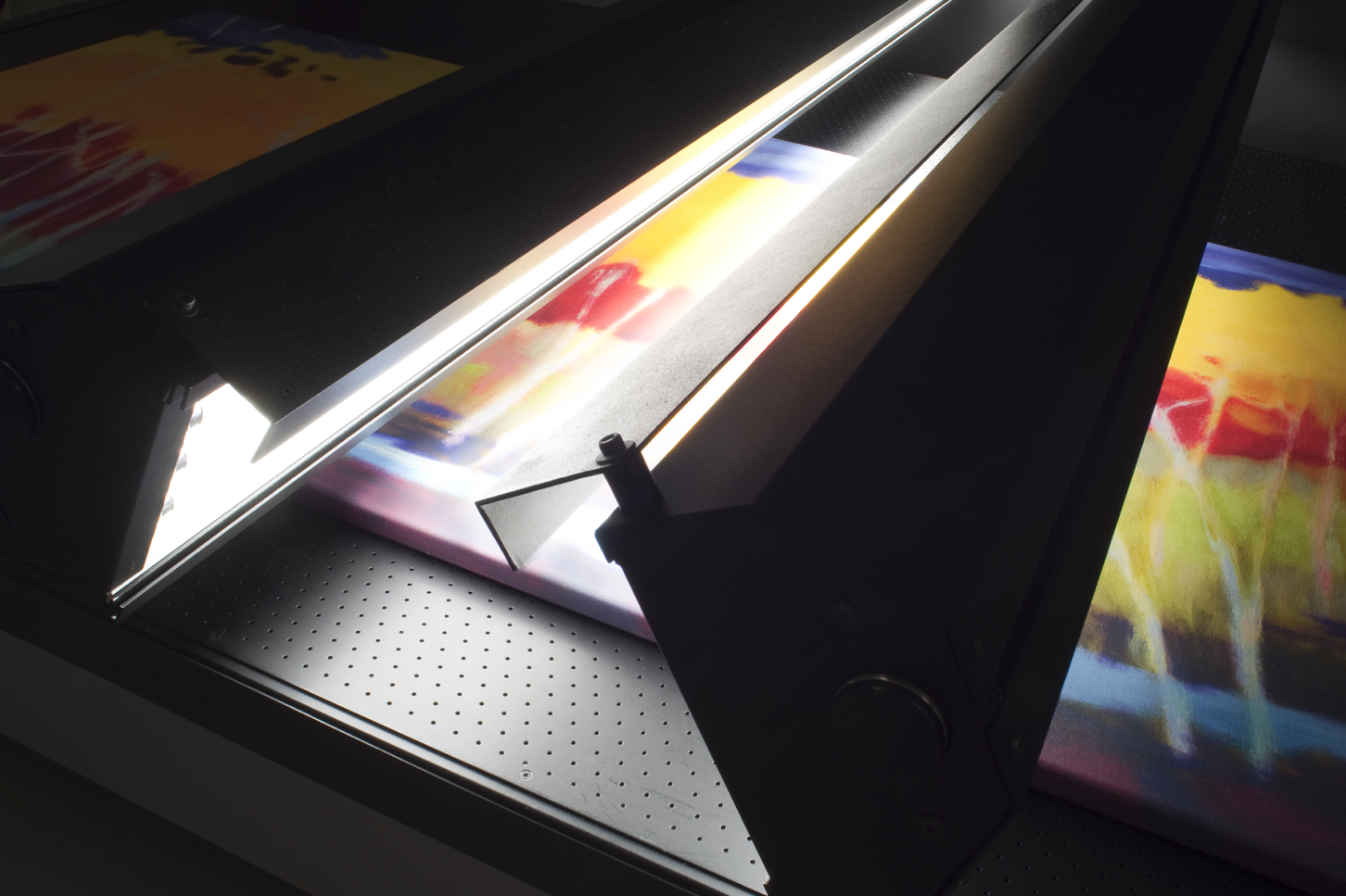
Or, you could use the Cruse Synchron capture system.  Because the Cruse system uses banks of daylight balanced florescent bulbs, the spectrum of the light source is as close as possible to the North-light studio.  Because it’s an inherently soft light source, it allows us to reproduce the softness of the light in the studio.  Because we can control the light direction and intensity, we can accurately simulate the light quality from a variety of studio environments.  …all at the push of a button.

Once again…  the secret of the Cruse?  It’s the lighting.
October 25, 2011

Fine Art Reproduction: The Importance of Viewing Light

We hinted in our previous post about the traditional “North light studio”, let’s look at that a little deeper.  The “North light studio” really holds the key to understanding the vision of the artist, seeing the work as the artist saw it, and interpreting the work as the artist intended it. As with any printer’s craft, the viewing light chosen for evaluating the print is of critical importance.

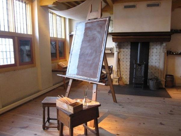
Here’s a modern-day photograph of none other than Rembrandt van Rijn.  Rembrandt worked in the mid-1600s, far before any modern lighting was even conceived.

What’s particularly interesting about this photograph is that the curators have obviously added track lighting to the room, shown as pools of warm light on the easel and some of the points of interest.  This serves our discussion really well, because by comparing the color and quality of the artificial lights and the window and skylights, we’re getting a pretty good idea of the differences.

You can see, quite clearly here, that the face of the painting has a distinct blue, or cool, cast.  This cool cast is very characteristic of light from the northern sky, since there’s no direct sunlight (which is significantly warmer) and can even shift to an even cooler cast if the sky in the North is a clear, blue sky.  What we sometimes see, when the artist’s studio has trees nearby, is the addition of a green cast from the light filtering through the leaves.  This makes a profound difference in the way a painting is perceived.

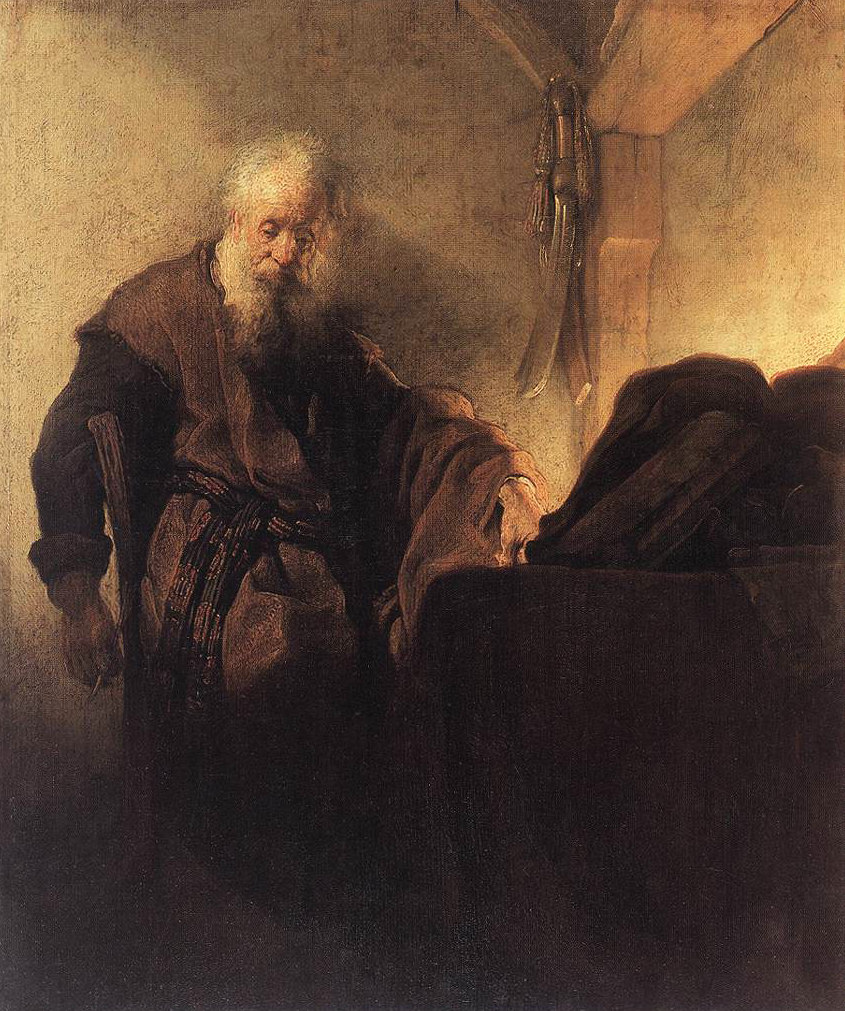
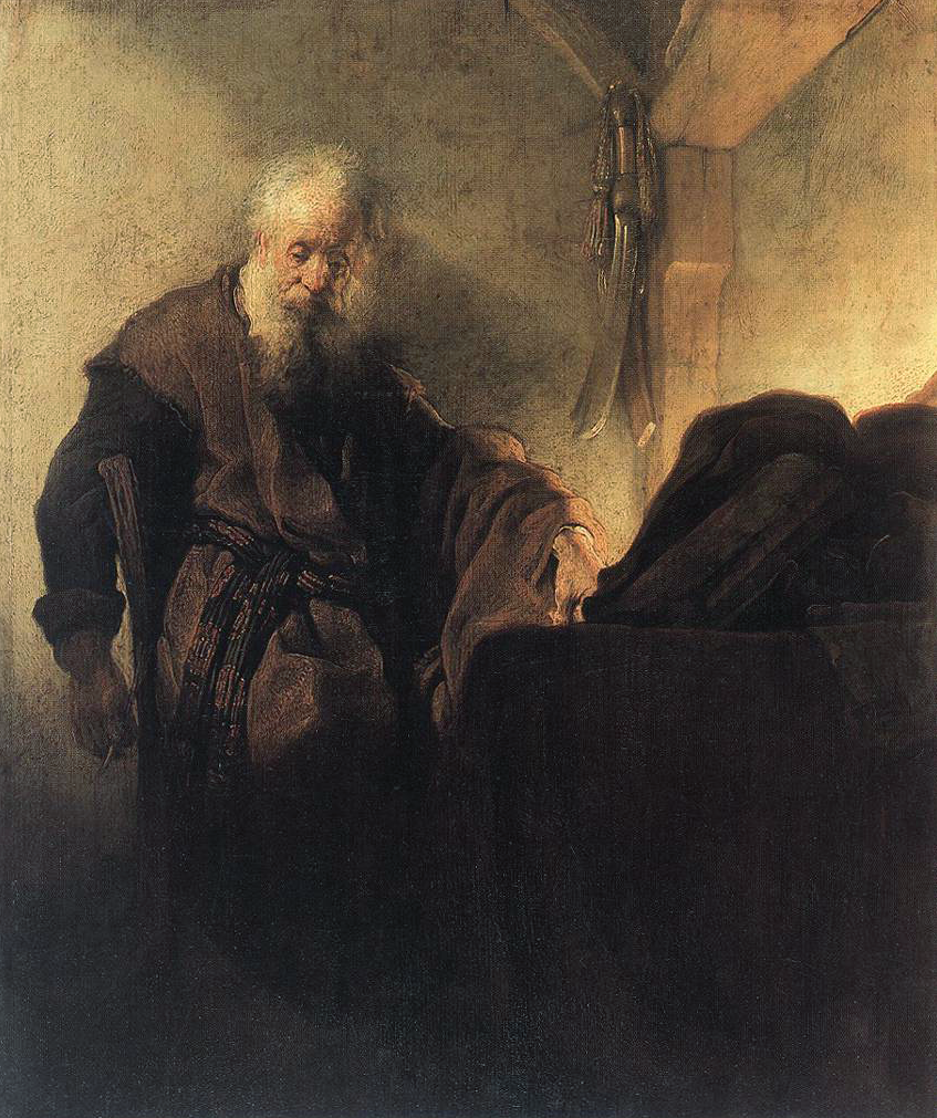
Here’s a photograph of one of Rembrandts paintings, Paul the Apostle in Meditation c. 1630, as it’s traditionally shown:

It has an overall amber cast, which would be amplified if lit under typical museum or gallery track lighting.  You light something with a warm light source, it tends to reflect that same spectrum at the expense of other colors.  Here’s where it get’s interesting.  In this painting the subject seems to almost melt into his environment, since there’s very little tonal or color difference.  Now look at it as Rembrandt may have seen it:
It’s a different feel.  The subject is now in the environment, no longer an intimate part of it, as a result of the cyan and blue tones in the background walls and shadows.   Admittedly, we’re making this change by adjusting the file to illustrate the point, but the validity of the point remains.  Depending on the viewing light, a painting or photograph can reflect different color spectrum response.  It can look different.  It’s crucially important in understanding the artist’s intention to view the painting as the artist saw it.

Is this important?  In the world of Art History, it’s profoundly important.  In an age where we can research, restore and recreate work as it appeared when it was created, new perspectives on the past accepted interpretations of work is changing how we understand the artist, and the time in which the artist worked.  And to coin a phrase, in the world of Art History, “wars have been fought over less…”

-Ted Dillard

October 24, 2011

Fine Art Reproduction: The Importance of Lighting Quality

Filed under: Uncategorized — Tags: , , , , — admin @ 11:03 am

Everything you’ve been told about how to light paintings is wrong.

Traditional fine art reproduction standards use lights mounted at a 45 degree angle from the baseboard, generally a high-intensity light aimed so that the work on the board is lit as evenly as possible.  Whether the light is a studio strobe, an HID (high intensity discharge) bulb, or a continuous-spectrum florescent, the light source, including the reflector and diffusers (if used), is relatively small, compared to the work.  Here’s what it will typically look like:

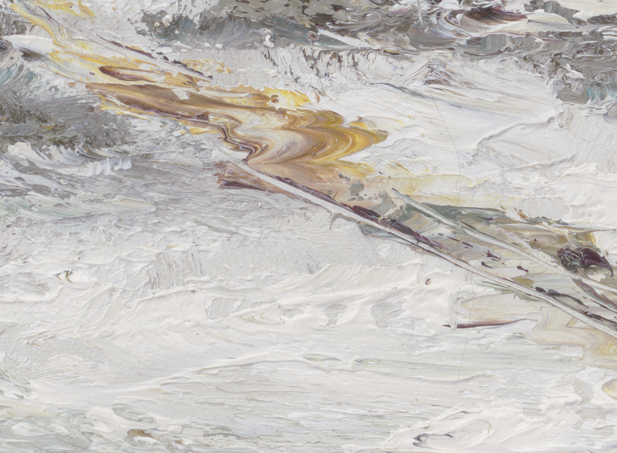
You’re essentially lighting the painting from two sides, evenly.  This creates a shadow on both sides of any part of the painting that has any depth- generally brush strokes.  It’s a basic principle of studio lighting…  for every light source you add, you’re adding another shadow.  Here’s what a detail of that type of lighting produces:

(Capture with Betterlight S8K2)

The impression of the image is that the brush strokes are confused- they’re hard to read, and hard to gauge the depth and direction of each stroke.  The contrast is relatively high, and the color saturation is also high, something we’ll go into later, but primarily due to the small diameter of the light source relative to the textures being lit.

When viewing the painting, almost any gallery, museum or other display will have quartz down-spots lighting the piece.  A typical museum will have a combination of soft ceiling-wide lights in a mock-skylight and quartz or HID downspots trained on the painting.  This gives you a significantly different sense of the work, since each brush stroke is lit from the top, with a shadow below it.  It’s easy to read, it is clear what the depth and texture of the painting has, and it contributes to an good interpretation of what the artist intended.  Using similar lighting, we can reproduce that painting with the same feel of a museum viewing experience.  Here’s an example of that:

 (Capture with Cruse Synchron CS220-110, L Textured lighting)

This is a significantly different interpretation of the painting.  First, the surface of the painting has modeling.  We can see where the top and bottom of a stroke is, and we can literally feel the depth of the paint on the canvas.  Second, the contrast and color are significantly more subtle, largely due to the relative size of the light source on the Cruse camera.  The Cruse uses a bank of daylight-balanced florescent lights, which produce a relatively soft, diffuse, but perfectly even and directional light source.

The result is a viewing experience that’s far closer to viewing the actual painting in a carefully lit environment.  There is simply no case where you will see any painting lit in the standard copy-reproduction lighting formula-  from both sides by harsh, direct lighting.  This traditional wisdom dictating fine art lighting is simply wrong.  It’s a completely artificial method of lighting artwork, devised from a technical standpoint of lighting work evenly within the limitations of the tools which were available, but not at all considering the experiential considerations of the reproduction process.
That is, traditional fine-art lighting completely ignores how the photographic process will change the viewers experience of the subject.

This can be taken one step further.  Consider the light under which the artist created the work.

Historically, painters worked in what’s known as the “North-light studio”, or, a studio lit primarily by a bank of large windows on the North wall of the studio and a north-facing skylight.  Since this prevents direct sun from entering the studio it yields a large, soft, even light source, relatively consistent throughout the day, and was by far the most common environment for painters even well into the mid-20th century.  This is even true for landscape painters, who would typically make their research sketches in the field, then return to their studios to create the final painting.
This large, soft and predominantly “cool” light source gave a significantly different impression to a painting than what we’re familiar with.  Here’s a simulation of what that would look like, captured with the Cruse camera with the softest lighting possible:

(Capture with Cruse Synchron CS220-110- LR even lighting)

This is probably what the artist saw when creating the painting…  or as near as we can recreate it in a fine-art reproduction environment.  It’s a significantly different experience, and it’s entirely due to the lighting used to capture the work.

Using the Cruse system to reproduce art work is far more than a simple, traditional copy/repro technique.  Because it gives such complete control over the quality of lighting, creating faithful reproductions of original art is much more than a reprographic process.

It’s a photographic process.

-Ted Dillard

October 21, 2011

Tech Tips: Epson Advance BW Grayed Out? (Photoshop CS5)

Filed under: Uncategorized — Tags: , , , , — admin @ 4:12 pm

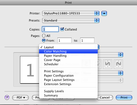
Having trouble printing with Epson’s Advanced Black and White driver with CS5?  There’s been a very tiny change in the driver that may just drive you crazy, it’s back under the “Color Matching” pulldown.  Take a look:

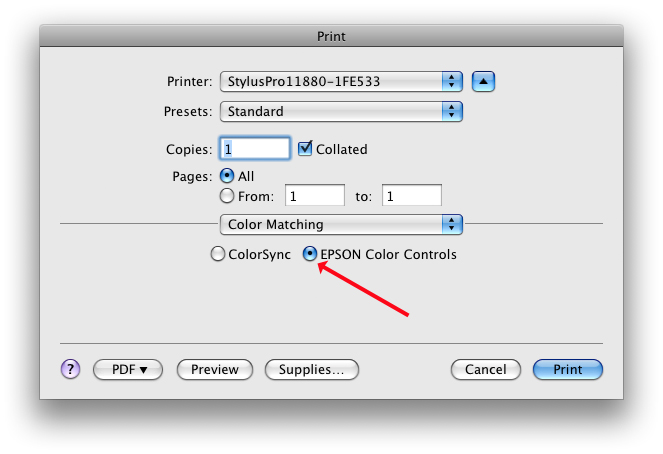
Starting with the normal process of selecting “Printer Manages Color” in the Photoshop “Print” dialog, you then go to “Print Settings”.  Along with the standard selections we all know and love, you need to go to this menu- “Color Settings”.  This used to default to whatever you’d selected in the Photoshop “Print” dialog, that is, if you asked for “Printer Manages Color” it would automatically select “Printer Color Controls” and gray out  the “ColorSync” selection.  No more.

Here’s what you get:

Now you have to go in and select “Epson Color Controls” to activate the Advanced Black and White options.

And…  as my buddy John from across the pond is fond of saying, “Bob’s your uncle!”

A big thanks to Derrick Feole for the heads-up!

October 18, 2011

Artist Profile: Huguette Despault May

Filed under: Uncategorized — admin @ 9:44 am


We had a great chance to have a visit with Huguette May, and talk to her about her work. Have a listen:

Visit Huguette at here site, www.huguettemay.com.

September 9, 2011

ParrotTalk News – September 9, 2011

Filed under: ParrotTalk News — admin @ 5:19 pm


Friday, September 9, 2011

Is it really September?

It’s been a busy summer here at Parrot, and, though we’ve all enjoyed a little time at the beach, we’re looking to roll up our sleeves and get back to work with some interesting and exciting new projects!


NEWS FLASH

Apple OSX Lion Status Report

A few short months ago, around the Fourth of July, Apple ushered in the Summer with an announcement for the release of their new operating system (OS) OSX Lion.  For $69 you can upgrade to the latest, greatest Big Cat in the Apple lineup, featuring a claimed 250 new features.  Upgrading is pretty simple, you need a system that meets these requirements:

·  Mac computer with an Intel Core 2 Duo, Core i3, Core i5, Core i7, or Xeon processor

·  2GB of memory

·  OS X v10.6.6 or later (v10.6.8 recommended)

·  7GB of available space

Note, you need to have an installed version of Snow Leopard (10.6) to install Lion (OSX 10.7). 

Now.  Here’s the million-dollar question.  Fine, you can move to Lion, but should you? 

There are a few things you should know, first.  With the release of this update, Lion has discontinued Rosetta support.  Rosetta is an emulation program that runs as a “shell”, supporting programs that aren’t designed to run on the newer, Intel chip processors.  The older machines used a “Power PC” chip, or “PPC”, and many older programs didn’t or couldn’t update to run on the new Intel chips, so to accommodate them Apple implemented Rosetta.  To put it as simply as possible, if you have programs that run only on a PPC platform, they probably won’t run on the Lion OS. 

As always, we suggest you keep your nice, solid working system intact, without making any changes that might interfere with production…  however, we know that’s not always possible.

Since we here at Parrot live and breathe digital color, we’re most concerned with our long-time standard Color Management applications first and foremost, and there’s a great site, the ColorWiki, that gives a rundown on where things stand with Intel and Lion support.  Here is that site:  www.colorwiki.com

Most current companies, like X-Rite, are taking advantage of the situation and releasing a new software package that’s fully Intel and Lion compatible, replacing older software.  That package is the i1 Profiler, and replaces the old favorite i1 Match.  The new software works on most current configurations, and provides all the functionality of i1 Match, and then some. 

There are some applications that, in spite of being held as the industry standards, are being left in the dust.  Monaco, ProfileMaker 5 Pro, the current, non-beta version of Colorthink, Pulse, Adobe CS2 versions and a few others will not run.  

Past just the Color Management tools, there have been several reports of printer drivers and ColorSync problems within Lion, along with other image-processing and RIP software issues.  The only thing you can really do to find out if your particular software is supported is to go to that site, look for Software Updates or Lion Support, and see what they say. 

If you are considering updating a current system, always follow the basic housekeeping advice and back up before doing anything.  In this case it is best to back up the entire disk image, so it can be restored if things go wrong.  You should be able to create a separate boot disk for Lion if you have enough room on your drive, and then reboot into whatever OS you prefer to work in- a great solution if you want to test the water before diving in. 

If you’re considering a new system, you don’t have a choice.  Any new Apple system is going to be running Lion.  If you need to run PPC-supported applications on your new system there are really only a few options to try, one is to create a Snow Leopard or Leopard boot disk on your Lion system (which will support Rosetta) and run your PPC applications through that. 

We say “try”, because, at the time of this writing, we’ve been told it’s possible and likely, but untested.  This strategy will NOT work on a new Macbook Air or Mini.  Those two models will not run in anything but a Lion OS. 

Another suggestion is to try an application like Parallels, which will run a “Virtual Machine” allowing you to run a different OS without having to re-boot.  The worst-case scenario would be to use this option, and run Windows XP or 7, and run your required applications as Windows versions. 

Oh, the irony. 

Resources:

General info page for Lion: www.apple.com/macosx/whats-new

“What’s New” page with the list of features and improvements: www.apple.com/macosx/whats-new/features.html

The Store page where you can order the Lion USB thumb drive, along with a nice overview of the whole package: store.apple.com/us/product/MD256?mco=MjQ1NzE3NDM

The new Mac App Store, an application that launches from your toolbar allowing you to download applications directly from their site, much like you’d buy music in iTunes, here: www.apple.com/mac/app-store

Back to top

FEATURE

Parrot launches www.theBIGscan.com


Sometime this Spring we got the idea to provide a website that was laser-focused on a service that only we offer- large format scanning with the Cruse Synchon system.  When we found that the domain name for www.thebigscan.com was available, well, we just couldn’t help ourselves.  In June, theBIGscan was born! 

Giving you a one-stop portal for all the important information on our large-format scanning capabilities, pricing, turnaround as well as some detailed information about what makes the Cruse scanning system different, www.theBIGscan.com makes getting large-format scans easy and fast.  You can contact us through the usual channels, or email us at info@thebigscan.com. Take a look, and wander over to the sample gallery to see some of the more unusual work we do! 

BACK TO TOP

PARROT IN THE NEWS

Parrot Gets Press!

We’ve been enjoying the spotlight of the imaging industry press quite a bit lately…  both collaborating with some of the leaders in the industry via Digital Output Magazine, and getting all the attention in a great story on Large-Format Fine-Art scanning appearing in the September and October issues of Art World News.  See the Digital Ouput story online here:

From Digits to Dollars: Wide Format Scanners Deliver Solutions

 BACK TO TOP

TECH TALK

The HP DesignJet T2300 PostScript eMultifunction Printer Changes the Colloborative Workplace 

Very few new products can claim to profoundly change the way you work, and think about work, but we believe the HP T2300mfp is going to do just that.  It’s really a simple concept.  We’re all used to the convenience of “MFP” machines in our office workflow, with the ability to print, scan and email documents from one workhorse laser printer.  Somebody at HP had the brainchild to apply this basic technology to wide-format printing and scanning.  It’s not new technology, it’s a way of combining existing technology to accomplish new things. 

You can now have one machine that will print up to 44” wide from either a workstation or a USP drive plugged into its console…  that same machine can scan and copy documents up to 36” wide. 

Here’s the interesting part.  The T2300 can both upload, and download, images and scans to the HP ePrint and Share “cloud”.  This is a free, collaborative subscription service offered by HP for any partners who need to have access to files.  For more information see the ePrint and Share site, here: https://h30510.www3.hp.com/public/features

This is huge.  How this gets used in a collaborative project environment is almost beyond our ability to speculate.  It truly is limited only by your imagination, and it’s going to change how you work with your global team. 

Let’s consider a simple example.  You’re working on an building project with teams all over the world.  Your client is in New York, the architect 

is based in Boston.  The building site is in London, and you have several architects from the West Coast and Europe contributing to the effort. 


Starting with the historical blueprints of the site, you scan them and post them to the ePrint and Share cloud where everyone can download and review them as .pdf format files.  If they have wide-format printing capabilities they can output their own copies.  They can be re-rendered as CAD files or drawings, and re-loaded to the ePrint and Share cloud, where they can be reviewed by the entire team.  Here’s where it gets interesting. 

People still like to mark up paper. 

The first generation drawings can be marked up in meetings or by key people, and simply scanned and uploaded, then downloaded anywhere and reviewed, much like a contract can be annotated and then re-sent by a law firm.  Any partner in the process can print, markup, scan and upload any documents required for the collaboration, if they have the HP T2300mfp.  If they don’t, at the very least they can follow along by reviewing the .pdf files from the ePrint and Share cloud. 

Have a project manager on the road about to give a key presentation of the latest changes?  By loading the documents on a USB jump drive and plugging them in to the nearest T2300mfp they can print them out at the push of a button, with no workstation, no drivers to load. 

To coin a phrase…  this changes everything. 

Back to top

Promotions

Big Deals on Epson and HP Printer

Both Epson and HP are offering some pretty aggressive incentives to replace that tired old workhorse you’re nursing along. 

From Epson:

Epson Professional Imaging is announcing instant rebate and mail in rebate promotions on select Epson Stylus Pro printers. …

The Mail In Rebates require a coupon to be returned by the end user. Coupons are provided and also posted on the Epson Professional Imaging Website. www.proimaging.epson.com

Here are the printers and the details:

On the Hewlett-Packard side, they’re offering generous “Cash In/Trade Up packages for selected printers.

The details:

Call or email us at Parrot for more details on how these deals can work for you! 


Back to top


July 29, 2011

Color Wiki: Mac OS X Lion Color Management Migration Tool

Filed under: Uncategorized — admin @ 5:21 pm

Mac OSX Lion update: Here’s a site, ColorWiki, that give a good list of Color Management software, with what runs, what doesn’t and what you need to update, in some cases, to get bach in business under Lion.  The issue, really, seems to be Apple dropping “Rosetta” support, which eliminates any program that is not compatible with the Intel system.  Take a look, here’s the introduction:

This page contains a reference table to aid in the migration to Apple’s OS X Lion (10.7) system software.

OS X Lion does not include the “Rosetta” technology that emulates the PowerPC (PPC) processor. Without Rosetta, any Mac OS X applications which only have PPC code will not run!

To determine if an application is PPC only try one of these methods:

  • Find the application on your hard disk and “Get Info” (command-I)
  • Run the application and then open the Activity Monitor to see the application type.

To view all the apps on your system for PowerPC software, try this:

  1. Click the Apple in the upper left corner,
  2. Select “About this Mac” and “More Info”
  3. Under Contents, open the Software list and choose “Applications”
  4. The “Kind” column lists whether the ap is PowerPC, Classic, Intel or Universal.

Many common Color Management tools and utilities are PPC only and will not be available to users running OS X Lion. X-Rite, CHROMiX and other companies offer tools that have been updated to run on Lion and will perform many similar tasks as the older PPC software you may be accustomed to using. Please refer to the following table to determine if there are alternatives for your tools and needs. Also, if you have an application or need that does not appear in this list, please let us know and we’ll do our best to add it to this reference tool.

July 11, 2011

The Cruse – Some Photos

Filed under: Uncategorized — admin @ 11:26 am

Yeah, OK, feeling a little like a proud grampy showing off baby pictures…  but here.  Look at my baby!  (It’s a b-i-i-i-g baby…)

Enjoy!

(© Ted Dillard, 2011 All Rights Reserved)

July 6, 2011

ALERT: Apple Announce OS X Lion – Time to Upgrade?

Filed under: Uncategorized — admin @ 10:48 am

Our advice?  An Emphatic NO!

July brings with it the release of Apple’s most recent “Big Cat” operating system, Lion.  Where Snow Leopard was all about developments “under the hood” that the typical user enjoyed the benefits of, but didn’t really see in the interface, OS X Lion is all about the interface.

From the Apple OS X Lion “What’s New” page: “People have been doing the same things on computers for years. Clicking. Scrolling. Installing. Saving. With OS X Lion, we’ve challenged the accepted way of doing things by introducing new features that change the way you use a computer.” (link to Apple OS X Lion page here.) It sounds like no less than an effort to change personal computing to the same interface as a smartphone or an iPad.  Very exciting.

Yet, very much a concern for anyone who makes their living in digital imaging.  Why?  Basic tools like Color Management between the OS and Adobe, printer drivers for our daily-bread printers like Epson, HP and Canon, and color management systems are getting caught in the corporate crossfire created by the Apple system changes, and the imaging user is getting left for dead.  Specifically, Snow Leopard, Photoshop CS5, and some specific printer drivers are still, simply, broken.  Apple blames Adobe, Epson blames Apple, Adobe blames everybody…  you get the picture.  But nobody is fixing the problem.  And this is Snow Leopard, the current OS, fuggetabout anything new.

What are we seeing?  There have been some severe driver issues where basic functions like printing with color management turned off are impossible.  Several older Epson printers simply don’t have drivers available for Snow Leopard.  Apple fielded Rosetta, an emulation workaround (remember “Classic”?) that has limited success running legacy software at best.  Color Management in Snow Leopard has produced unreliable results.  It’s an exercise in futility to try to get help from the responsible parties…  even on the forums, the Epson, Apple and Adobe “players’ are playing hot-potato with the issue, and there simply are no workarounds.

What should you do?

If you rely on good color management and predictable results from your printing system, do not upgrade, even to Snow Leopard.  We use Photoshop CS4 and Leopard for our imaging workstations.  We’ve been forced, several times now, to suggest to our clients to bring their old Leopard (10.5) workstations back on line to solve their driver/Color Management issues.  Simply put, if it’s not broke, don’t fix it.

You should always keep a “legacy” system online, or at least waiting in the wings.  Even if your older system has failed in some way, what seems impractical to repair today, may seem a lot more cost-effective in a year – when nothing will run your printing system anymore.

If you’d like to have the latest, greatest toys, and simply must play with OS X Lion, then do it on a non-essential machine.  Better yet, go buy yourself a new laptop you can play to your heart’s content on…  but don’t mess with your income.  Your imaging workstations are your cash cow.  Resist the urge to tamper with them.

What if you need a new machine?  Are there solutions to running good imaging workflow on OS X Lion?  Not that we’re aware of.  You cannot buy a new Mac and install Leopard on it – it won’t run the hardware.  You can’t “backtrack” the OS.  Will updates and patches fix the issues?  Nobody can say.  There is one possible workaround, and that is to work with a “Virtual Machine”, through programs like Parallels and VMware Fusion. Using these, you can run other operating systems on your Mac.  Like Windows.

And Windows7, ironically, is running imaging systems just fine, thank you.

For some interesting reading (some current information along with some good commentary), check out the Luminous Landscape forum discussing OS X Lion and printing: here.

From there comes the best advice, via David Watson:

“The most important aspect of using a computer as a tool (rather than a software development machine) is that it runs reliably and quickly enough to the job.  Only when applications start to demand an OS upgrade to continue functioning should one consider it. “

June 23, 2011

Secrets of the Parrot Test3a Revealed!

Filed under: Uncategorized — admin @ 1:50 pm

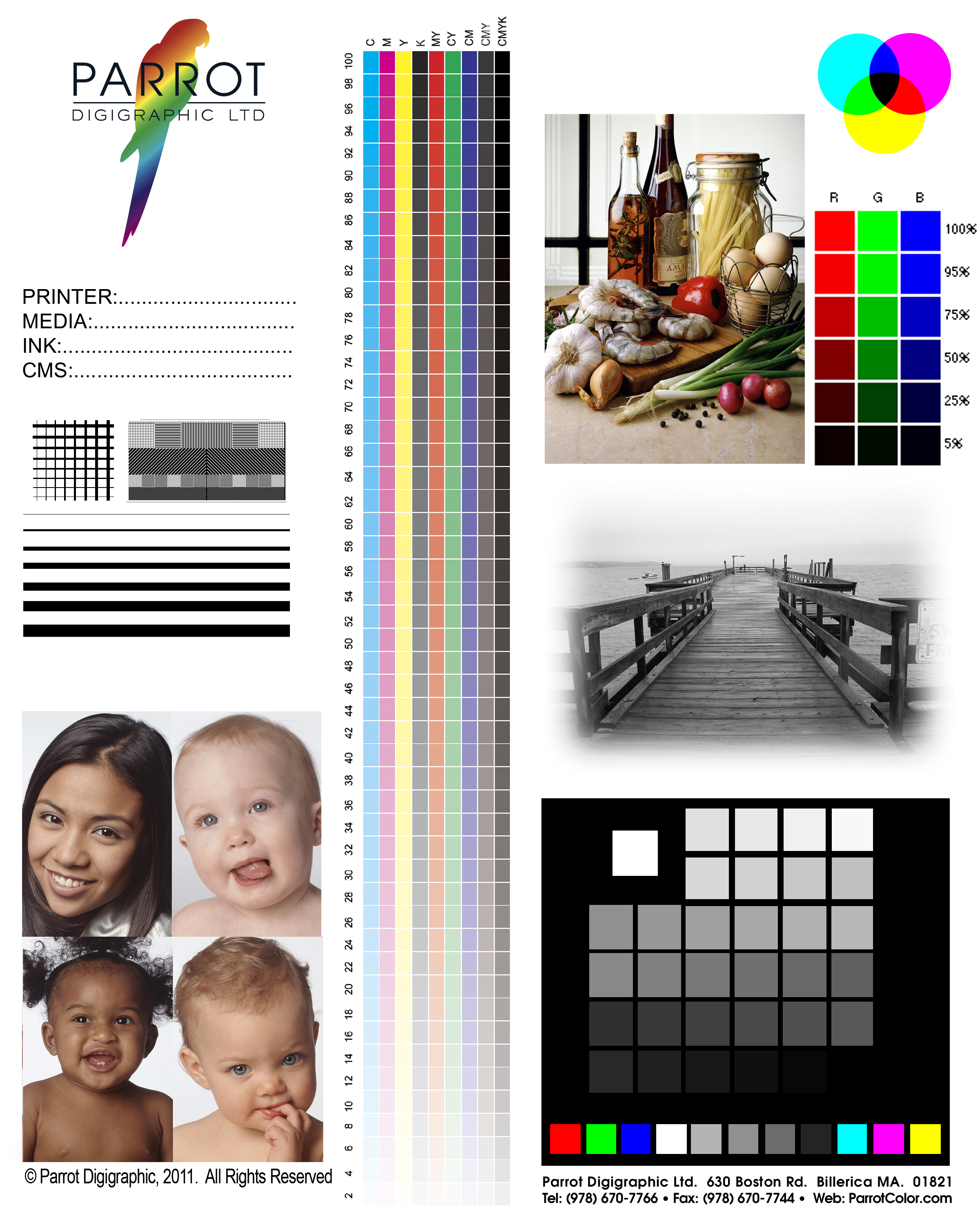
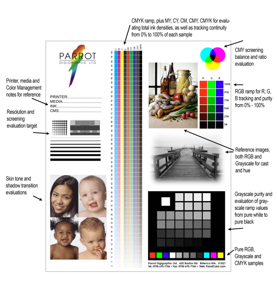
You’ve heard us talk about it.  Maybe you’ve even had one of us email you one.  Well, now, here’s your own special copy of the Infamous and Notorious Parrot Test3a target!  Just click the photo and you can download the full-sized JPEG file in a few short seconds.

Great, you say…  but what does it mean?

From the most simple use, it’s just a known target.  It’s in Adobe RGB (1998), and we’ve printed it on literally every professional inkjet printing system made since about 1997.  We can look at the Parrot Test3a from across the room, and get a feel for whether a printer is behaving itself.

Beyond that, though, it’s a target that we look at very carefully to evaluate a printer, a paper, inks and how a profile is behaving in real-world terms.  Here’s a little key to what we look at.

There are a few things we look at right off, and the Grayscale patches in the lower right are the first of them.  The bottom row, in particular, tells us how heavy the ink load is on the paper, and if we’re holding a tone into the lowest values.  Overall, the Grayscale patches tell us if there’s a hue being introduced into the neutral values, contaminating the basic CMYK ramps of the inks.

What the callouts don’t show you, though, are what you see when you look at the paper.  Is it buckling from being over-saturated with ink?  Is in nice and even?  Can you see through from the back?  You can do this with any target, but the Test 3a shows us in a very predicable way.

The sample shots are really there just for an impression of how the tonal values are being reproduced in a more subjective way.  That said, those four portraits in the bottom left give you a very accurate impression of the skintone rendering, a tough job, as well as how the tones transition to the deeper shadows.  More than a few times we’ve seen distinct banding under the hairlines of those models, or a bright magenta where baby-face pink should be.

It’s most useful for evaluating a new paper, though, for us, but also for you.  After you print it a few times, you’re going to start expecting a certain look, and you’re going to see when a new paper strays from that look, for better or worse.  Does the print look softer?  Snappier?  How rich does it appear?  That’s a start…  but with the Test 3a, we can look under the hood and understand exactly why the paper appears as it does.

Yes…  it can get pretty geeky pretty quick.  But as we like to say around here…  embrace the Inner Geek!

Older Posts »

Powered by WordPress