We hinted in our previous post about the traditional “North light studio”, let’s look at that a little deeper. The “North light studio” really holds the key to understanding the vision of the artist, seeing the work as the artist saw it, and interpreting the work as the artist intended it. As with any printer’s craft, the viewing light chosen for evaluating the print is of critical importance.
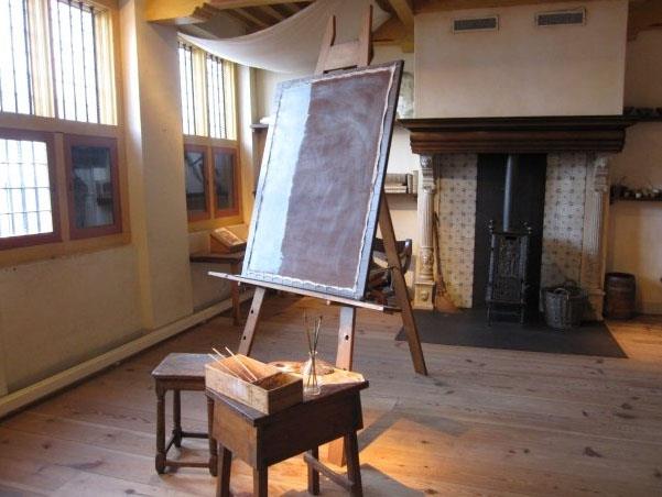
Here’s a modern-day photograph of none other than Rembrandt van Rijn. Rembrandt worked in the mid-1600s, far before any modern lighting was even conceived.
What’s particularly interesting about this photograph is that the curators have obviously added track lighting to the room, shown as pools of warm light on the easel and some of the points of interest. This serves our discussion really well, because by comparing the color and quality of the artificial lights and the window and skylights, we’re getting a pretty good idea of the differences.
You can see, quite clearly here, that the face of the painting has a distinct blue, or cool, cast. This cool cast is very characteristic of light from the northern sky, since there’s no direct sunlight (which is significantly warmer) and can even shift to an even cooler cast if the sky in the North is a clear, blue sky. What we sometimes see, when the artist’s studio has trees nearby, is the addition of a green cast from the light filtering through the leaves. This makes a profound difference in the way a painting is perceived.
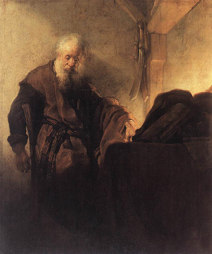
Here’s a photograph of one of Rembrandts paintings, Paul the Apostle in Meditation c. 1630, as it’s traditionally shown:
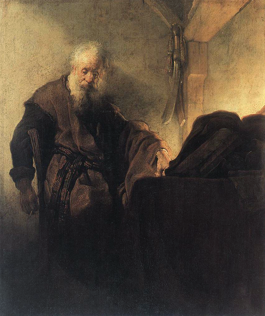
It has an overall amber cast, which would be amplified if lit under typical museum or gallery track lighting. You light something with a warm light source, it tends to reflect that same spectrum at the expense of other colors. Here’s where it get’s interesting. In this painting the subject seems to almost melt into his environment, since there’s very little tonal or color difference. Now look at it as Rembrandt may have seen it:
It’s a different feel. The subject is now in the environment, no longer an intimate part of it, as a result of the cyan and blue tones in the background walls and shadows. Admittedly, we’re making this change by adjusting the file to illustrate the point, but the validity of the point remains. Depending on the viewing light, a painting or photograph can reflect different color spectrum response. It can look different. It’s crucially important in understanding the artist’s intention to view the painting as the artist saw it.
Is this important? In the world of Art History, it’s profoundly important. In an age where we can research, restore and recreate work as it appeared when it was created, new perspectives on the past accepted interpretations of work is changing how we understand the artist, and the time in which the artist worked. And to coin a phrase, in the world of Art History, “wars have been fought over less…”


